Dragon Age 2 How BioWare refined the design of their characters for the second installment in the Dragon Age Franchise with the help ZBrush.
Six months ago we did an interview with the artists at BioWare regarding their work on the critically-acclaimed dark fantasy game, “Dragon Age: Origins”. At that time it was common knowledge that the sequel was in progress and the team hinted that they really wanted to share info about it but couldn’t.
Flash forward to today. “Dragon Age 2” is launching on March 8, 2011 and we’re here right off the bat to bring you a first look at the game’s new art direction. As a sequel, BioWare wanted to up the ante from what they accomplished in the original – pushing both the engine and themselves to make everything more spectacular. Did they succeed? You be the judge!
SPOILER ALERT: This interview does contain a few spoilers regarding the game’s story. If you haven’t played the game and don’t want any secrets revealed ahead of time, stop reading now. The interview will still be here when you’ve finished!
In what ways can we expect the visual style to change for Dragon Age 2?
Shane Hawco (Lead Character Artist): There are many distinct things that were done with the entire art style of the game. One of the things that we really wanted to change from “Dragon Age: Origins” was to give the creatures and characters a more distinctive physiology, style and identity that ties them closer to their background and ethnicity.
The elves, for example, are not just smaller, skinnier humans with “knife ears”; they now have a closer connection to their natural and organic background. In order to do this we elongated their form, amplified their more curvy and organic features and gave a majority of them bare feet which directly connects them to their environment. We also reflected these ideas in the facial structure; they have a more oval base with soft curved features on the cheekbones and jaw lines, and their smooth forehead transitions into the small subtle nose between the enlarged eyes. Overall they look more fawn-like, which is a very clear connection to their forestry origins.
The elves were not the only ones who got this treatment - the other non-human races did as well. For example, the dwarves contain more angular elements that are similar to dwarven architecture, further anchoring them to the ground. These elements are carried to the face where they have a more chiseled jaw line, angular nose and squared off eyes.
What was your main goal from a graphics standpoint going into DA2? How would you say you've done toward that realizing that goal?
Shane Hawco: One of the main goals on “Dragon Age 2” was to improve the lighting on the characters in order to help display the extra effort and care that went into the creature and character redesigns while at the same time make them feel like they are anchored to the environments that they are in. We also added gibbing in DA2 to a lot of the creatures and characters to help with the new flow of the improved combat system. Nothing makes you feel more badass than to shred an enemy into exploding chunks of meat! There are also vast improvements in the character heads such as improved facial topology for more expressive emoting, improved facial texture density and a more realistic eye shader. We made smaller graphical tweaks like self-shadowing, moving hair and cloth simulation to help further engage the audience with the characters and story of Dragon Age 2.
What was the transition like going from Origins and its downloadable content to Dragon Age 2?
Shane Hawco: It was fast and aggressive… but we made some very smart decisions by using the “Dragon Age: Origins -- Awakening” expansion pack and other DLC such as “The Golems of Amgarrak” and “Witch Hunt” to help develop some of the creatures featured in Dragon Age 2. The Harvester and Varterral (or Stryder as we like to call it) make a return and were always planned for the sequel. By using the DLC modules from DA:O as a proving ground for them we could not only test the creative waters but also give the fans a preview of what we are up to as well. It’s been a very successful process which I’m sure we’ll be continuing in the future. (Hint, hint)
Now that you can talk about it, how has the technology changed in DA2 and what has that freed you to do graphically?
Shane Hawco: Lighting was a major focus for improvement on Dragon Age 2. Along with this we changed the compression settings for the textures, allowing us to get more performance of out the maps used for the characters and allowing for more creatures on screen at one time. This also allowed us to have a higher visual quality per asset, making key assets really stand out.
How much were you able to reuse assets from the previous game? For those that you did reuse, how much reworking did you end up doing?
Shane Hawco: Most of the assets that have been carried over from Dragon Age: Origins to DA2 such as the Spiders, Shade, Revenant, Rage and Desire Demons have remained pretty much the same but they have all undergone some small improvements to their textures and in some cases improved topology to not only enhance the shapes but also allow for better movement and smoother animation.
You obviously have a lot more experience now working with the game engine and with the Xbox platform. What new graphic elements or technologies have you been able to bring into play?
Shane Hawco: One of the main focuses on Dragon Age 2 was to raise the visual standards of the game on consoles. By making the assets with consoles as the main platform, it forced us to find creative solutions that would best handle the budgetary restraints. This enveloped all parts of the character creation process from concept to modeling to shaders and animation. By working with all the different departments involved on DA2 including art, animation, programming and design we’ve made drastic strides in improving the quality on the consoles. For the PC there have been some additional efforts by the graphics programmers for cards that feature DX 11 such as more dynamic lighting, additional tessellation on terrain, diffusion on depth of field and contact hardening soft shadows. All around, things are looking fantastic and I think no matter what platform you choose the results speak for themselves!
How much customization are we able to give Hawke? Since the player character is now only human in this game, did you take the opportunity to let the player have even more freedom at character creation?
Shane Hawco: Since so much care and effort went into the creation of both the male and female versions of Hawke, we wanted to make sure that they kept their iconic image. If you play with iconic Hawke, the only change you can make is removing the blood mark. We also wanted include character customization as we did in Dragon Age: Origins and allow the player to create a unique appearance and make their very own Hawke. Since in DA2 you play the role of a fully-voiced Hawke, the entire character art team worked closely with animation to improve the topology of the face base mesh in the customization tool, allowing for a more emotive, fluid and believable character. On top of this we added more hair and beard variations and improved upon all the shapes and choices available in the character generator allowing for more precise and specific facial choices. The end result is that when a player chooses to make their own Champion of Kirkwall they will have all the customization without losing any believability or functionality from the one we’ve put a lot of effort into.
Since the story has shifted from multiple player character origins to just focus on Hawke in this game, let's talk about the evolution of that character. How did you arrive at the initial concepts for him, and how did that evolve into the final character?
Shane Hawco: The team wanted to tell a specific story for Dragon Age 2, around an important character within the Dragon Age universe; the Champion of Kirkwall. With this character being such an important part of the game, we wanted to make sure that he had a unique, recognizable identity. Since we are in a fantasy setting the character started with a Mage background, but we wanted to avoid the stereotypical caster role, running around in a colorful robe conjuring magic missiles out of thin air.
Additionally, being a mage in the world of Dragon Age is not a favorable thing. We wanted to show that this character had to be a badass survivor that could handle the constant oppression an apostate can encounter -- a rebel and revolutionary so to speak -- who can handle himself on the battlefield with more than just spells and trickery but also a staff with a blade at one end to give him an “edge” during the inevitable melee encounters. We felt that if we imbued the Champion of Kirkwall with elements of a lone wolf, it would help identify his unique, rebellious character. The lone wolf displays strength in solidarity but is also a figurehead who is quite capable of leading a pack. You can see these wolven references in the darkened color pallet, the elements of a fur pelt around the neck, and a wolf-inspired staff. From there we added strong, simple, angular shapes (following our new art direction), borrowing elements from the new Darkspawn as trophies signifying his success in surviving the attack on his home town of Lothering. We showcased the strength he gathers from his bloodline with the blood marks on his face and arm, which we presented in the “Rise to Power” trailer. From there we then designed Warrior and Rogue variations of the Champion, with an emphasis for each version on showcasing the special abilities of their class. You can instantly see the difference between the classes once you start up the game and dive into the combat of the prologue.
Are the Darkspawn still the main enemies in Dragon Age 2? How have they changed visually since the previous game?
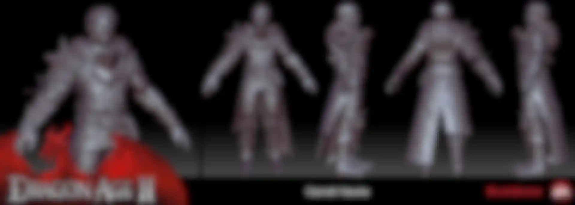
Shane Hawco: Although the Darkspawn are a major threat in the Dragon Age Universe and a large part of the beginning of Hawke’s story, they are not the main focus in the rise to power of the Champion of Kirkwall. With the new art direction we wanted to make sure they evolved to feel more like a complete and cohesive group, as opposed to the more hodge-podge feeling they had in Dragon Age: Origins. We reduced their color pallette to the bare minimum; very de-saturated almost to the point of being black and white. Along with the simplified color palette, we the simplified the shapes to focus on angular elements.
Since the main concern with the Darkspawn is infection and the blight, we felt we could keep their armor very primitive in nature, almost to the point where they are not well protected and are vulnerable on their backside. This somewhat reduces the threat level for the lower ranked units like the Hurlocks, but bolsters the players badass-ness by having them explode into shredded meat bags upon death! But with this we by no means wanted the Darkspawn to look like pushovers to be plowed through. We solved this by making the Ogre and Emissary Darkspawn very large and intimidating, towering over the player. They can be quite the challenge to deal with and we want them to be a significant threat, especially when they are supported by a large army of Hurlocks swarming in from all directions.
One of the most interesting characters in Origins was Sten, simply because it was so hard to find out anything about him or his race. (I still learned new things the last time I played through the game!) Are the Qunari back in DA2? If so, what can we expect to see there?
Shane Hawco: The Qunari definitely make a return in DA2 in a big way! You’ll have lots to discover about them since they play a very pivotal role to the story of Hawke’s Rise to Power. With the re-introduction to the Qunari we felt it was a great opportunity to have their appearance match the complexity of their character, culture and background.

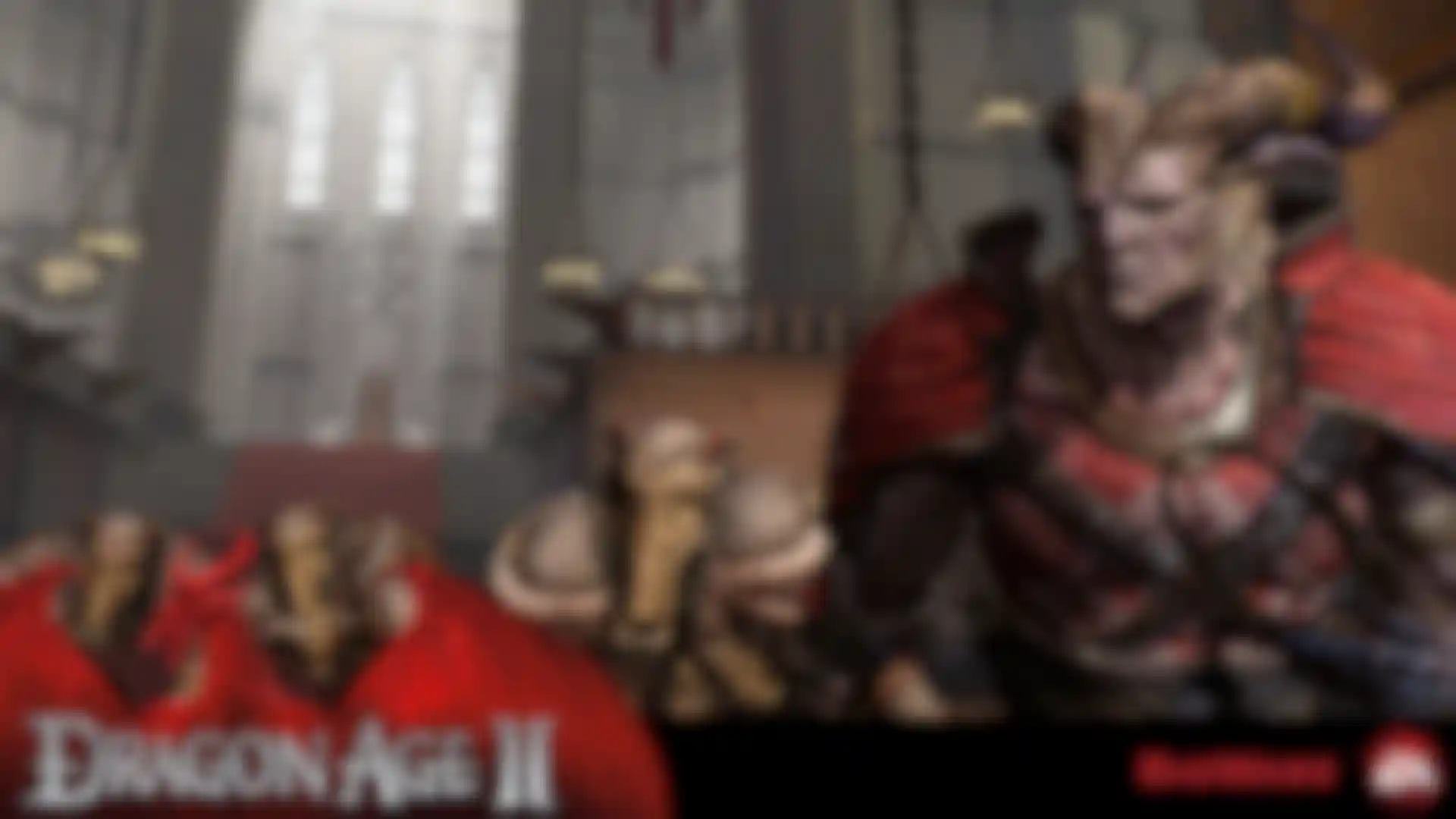
They are a hardened and proud people with a rich and dynamic history which is encompassed by honor and glory. We dug deep into the archives and developed a look similar to what we originally envisioned for them in Origins. We brought back the horns and pushed the boundaries of a humanoid form, increasing their height and bulk to enhance their intimidating and imposing nature. But they are not just a mindless race of barbaric warriors. They pride themselves on their belief system, called the Qun, which governs all aspects of Qunari life and thus was a very important element in their re-design. We have adorned their bodies with the symbol of the Qun. On most of the Qunari, it is painted on their bodies, but the Qunari Arishock has the symbol embedded in his armor, further showing his status as a leader and the commitment he and his people have to the Qun.
Did you take the same approach with armor in DA2 as you had in Origins? Or as with Mass Effect 2, did the system undergo an overhaul? What can we expect visually with the armor and weapons?
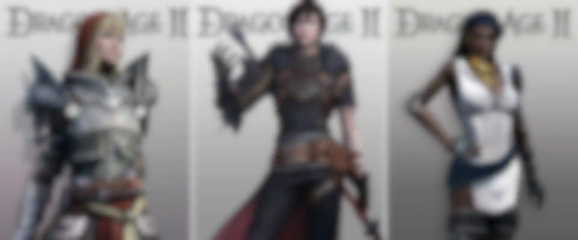
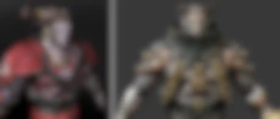
Shane Hawco: The Armor and weapon system in DA2 is similar to that in Origins where the armor, boots, gloves and accessories are all interchangeable for the player. But in the case of the followers we wanted to ensure that they didn’t get lost in the mix. We gave followers unique outfits that are instantly recognizable, making them easy to identify in the heat of battle. Unlike the followers in DA:O who tend to get lost in a mire of leather, metal and mystical cloth, when you look at the follower lineup of DA2 you’ll see a cast of identifiable characters whose visual look plays a big part in their personality. Accessories such as rings, belts, and amulets can still be added to bolster their stats and you can change their weapons. (Except for Varric, whose crossbow “Bianca” is a character all its’ own.)
For Origins you developed systems and technologies that let you create highly diverse NPC's. How has that system expanded for DA2?
Shane Hawco: Those systems were a part of a very successful and powerful set of tools in Dragon Age: Origins that helped breathe life into a large variety of characters and bring the richness of the world, but we still felt we could add to the system and improve upon some of the elements. For example, the faces got a complete overhaul in topology and texture to help give the characters not just an improved look but also drastically improved animation and emotion. Since DA2 deals with a very specific character and various members of his/her family we really wanted to make sure there was a system in place that allowed for believability of this even when the player made a custom character. So there are numerous custom family members built around all the different possibilities of the customizable facial features. Although this was a challenging task to get our heads around, I think it works quite well and will further the player immersion and experience when taking on the role of the Champion of Kirkwall.
You've said that Origins had over 70 unique creatures. How does that compare to the sequel?
Shane Hawco: Although not all of the creatures from Dragon Age: Origins make a return, the ones that do are now sleeker and meaner. We have also added some new, more complex creatures to the game that go far beyond anything that we’ve tried to pull off before. The Rock Wraith has various states that it can assume, changing not only his appearance but also activating different abilities that challenge the player’s tactics during combat. This is also the case with the Gate Guardians who make a surprise appearance when they and the slave statues come to life right out of the environment to add an extra element of chaos in the climactic end battle.
What was the most complicated asset for which you used ZBrush? How was ZBrush used?
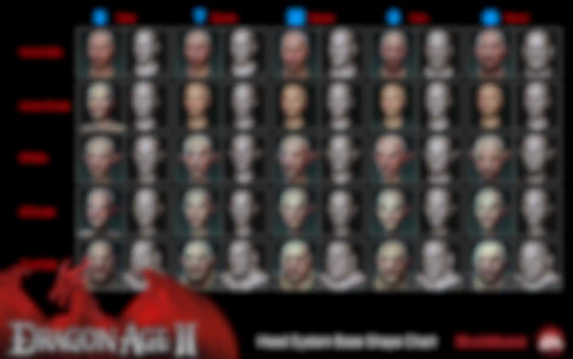
Shane Hawco: During the development of DA2 we actually found ZBrush an excellent tool for helping redesign the head system and bring a uniqueness to the base shapes in the head morph tool.
One of the concept artists on DA2, Ramil Sunga (who did character art on Dragon Age: Origins), helped the character art team develop the base head shapes and the unique direction for the main races in the game: humans, elves and dwarves. He took some of the final textured heads from Origins and used the shaping tools in ZBrush to help derive a more complete set of concepts that would allow us to better visualize what the final product could look like.
Ramil Sunga (Concept / Character Artist): ZBrush is extremely useful and time-saving when we create head variations. Using different shaders and combining them is extremely handy, saving me tons of rendering time. Just spending an hour or so, I could get a completely different head variation, rendered with full rotation.
Do you use ZBrush in environmental work as well?
Shane Hawco: ZBrush was instrumental in making a lot of the props for the environment such as the Ossuaries in the Bone Pit, the Grand Entrance to the Viscount’s Keep and the doors of the Chantry. It was also used for what we call “hero pieces” such as the Champion of Kirkwall statue celebrating the defeat of the Qunari and some of the unique artifacts that you can find in the Black Emporium (a free add-on for those who buy the game new).
The models in game use a variety of maps. Is ZBrush used to create any of them? For example, do you use PolyPaint at all?
Shane Hawco: On DA2 we didn’t really use the PolyPaint feature in ZBrush as part of our pipeline although we are open to its possibilities. We mostly use ZBrush for our high-poly sculpts where we then bring them into 3ds Max after the use of Decimation Master to help bring down the sculpt poly count to give us a higher performance when generating most of our normal and ambient occlusion maps. On occasion we will use ZBrush to bake these but once we commit a method to a pipeline we try to stick with it for consistency of assets over the span of production.

Have you transitioned to ZBrush 4? If so, how is it helping your team?
Shane Hawco: When we upgraded to ZBrush 4 one of the very first things we noticed was the great performance increase and stability plus the new brushes like MatchMaker and Move Elastic. With the quick timeline of DA2 we didn’t have much time to investigate it further. We are intrigued by the ease of back and forth with GoZ to Max and the possibilities of PolyPaint, as well as features like the Best Preview Renderer’s ability to save out multi-pass renders.
In Origins you were just starting to get a handle on Decimation Master. Has your use of that tool continued to evolve?
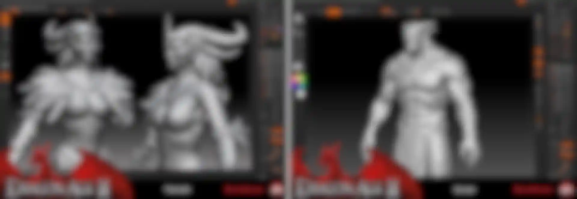
Shane Hawco: One of the best things about Decimation Master is the ability to maintain the details of a high-res sculpt without the hit on memory that comes with the use of a larger file size. Even with the very powerful machines we have here in the studio we find this to be a great time saver for rendering out our normal maps and generating the AOs from sculpts. We have also found that when working with outsourcers this is a very handy tool indeed as we are able to transfer and load sculpts quickly, helping us critique faster and get the assets complete and into the game sooner.
In the last interview, you each said what you thought was your favorite ZBrush feature. Now that you all have even more experience with ZBrush and its features, I'd love to hear how you'd answer that question today.
Ben Carriere (Senior Character Artist): Our production schedule kept us busy and it made it hard to explore all the new features of ZB4. Here are the ones I found so far that are quite useful:
- GoZ – Such a time saver. You can fix or change models in a few clicks without having to do a ton of back and forth on your mesh.
- New Brushes - They are pretty cool. There are so many now, I still haven’t had the time to test most of them but I’ve noticed that sculpting feels a lot closer to using real clay than it did before.
- Visibility – Grow, Shrink and HidePt combined with Masks are very useful in getting only what you need to work on screen. Saves time. I don’t think I’ve had to create or use custom masks since I started using it.
- MatCaps – The ZBrushCentral community is doing a great job at creating them. Thanks! It helps a lot in seeing how your model reacts to different lights with just a simple material change.
- Decimation Master – Such a time saver! Baking normal maps from “hi-res” parts directly from ZBrush is now possible. It used to be tricky to do this, but now it’s a breeze.
Leroy Chen (Character Artist): Last time I mentioned Decimation Master and that is still one of the most used functions in our current pipeline for baking out our hi-res details. I also found the new UV Master to be pretty easy to use for some fast and efficient unwraps. But the Brushes are still my favorite. All the hard surface brushes like the Planar Cut and Trim Dynamic brushes are extremely useful when it comes to creating crisp, clean hard surfaces. I also like the noise function as well; it helps me add an extra layer of detail on different surfaces without me having to go through the effort of creating alphas for them. When I made the Rock Wraith it was still back in ZBrush 3 but I can see that creatures with this nature would’ve greatly benefited from all these new features.
Jae Keum (Character Artist): One of my favorite features is the Roll brush. This function is quite useful to make details like stitches and rivets on clothes and armor. When it comes to baking out textures I think Multi-Map Exporter is quite handy. It extracts many kinds of maps at the same time with just hitting one button. These features save a lot of time for making 3D assets.
Francis Lacuna (Character Artist): Its funny; I've been using ZBrush for years, mostly utilizing the features necessary just to get the job done. Once Dragon Age: Origins shipped and we got our hands on the upgraded engine for the sequel, I've been able to tinker with ZBrush a little further. This is probably old hat for a lot of you, but I've gone back to the basics and stumbled across the Crease feature. That thing is a time saver for hard surfaces! Additionally, I've really been getting a lot of mileage with several brushes, particularly the Polish brushes and the Mallets. Fantastic tools for adding some age and wear to metal.

What is your favorite asset in DA2 and why?
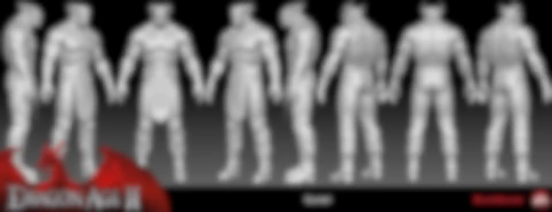
Ben Carriere: I'd have to say the Qunari. Jae did an awesome job in rebuilding them. I really like how they turned out. You can feel the intensity of their stare. He really captured their essence; they have this stern and noble warrior look and you know you shouldn't mess with them. There are a lot of cool models in DA2 but I think they are one of the best ones we got.
Leroy Chen: I love the Qunari, especially the Arishok. Jae did an awesome job on the models. I like how the voice acting and the story brought him to life. He’s probably the most compelling character in the whole game. There are actually a few moments when I was struck by the emotions coming out of him. I sincerely hope people will enjoy him as much as I do.
Jae Keum: I love the Qunari, especially the Arishok. Jae did an awesome job on the models. I like how the voice acting and the story brought him to life. He’s probably the most compelling character in the whole game. My favorite asset in Dragon Age is the customizable player character head. It comes with a bunch of sliders to control shape of face, hair and skin and it has strong ability for users to build any face they want.
Francis Lacuna: I would have to say Flemeth. For those unfamiliar with the character, she is the Witch of the Wilds, a returning character from Origins voiced by the dulcet tones of Kate Mulgrew. Her redesign for the sequel seemed a gamble at first, going from a crazy old lady living in a shoe to a crazy old lady who can turn into a dragon, eat Darkspawn for breakfast and is also kind of a hot babe... Which is disturbing and awful and at the same time – awesome! Definitely my favorite. But if we're talking strictly art assets here, there is this fantastic door guarding the Chantry in Hightown. Seriously, it's the best door in the franchise yet.
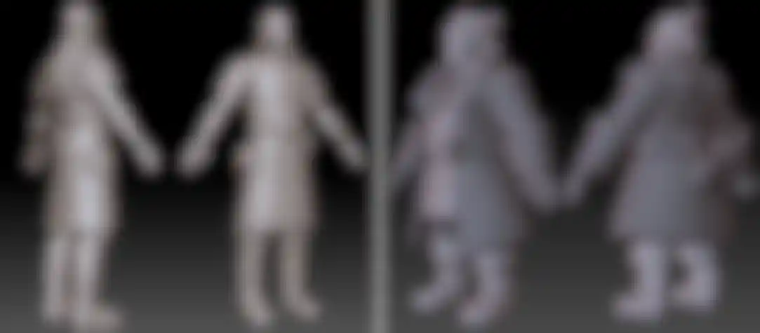
Rion Swanson (Senior Character Artist): There are so many well crafted characters in Dragon Age 2; I must say however that of the party members I’m partial to Varric only because I know him best. It was a pleasure to join the DA2 team for a while to work on Varric. Because of time constraints, I only ended up working on the body model and an early head sculpt. I enjoyed seeing the final character in game, and Ben Carriere and Jae Keum did a great job on the final head and hair. Varric really struck me as being unique; his voice and personality, his costume, his beloved heavy weapon all combine to make a memorable character. His overall shape with bulky coat, large cuffs and collar, wide belt, and sturdy boots all made for an interesting stocky form to model. Once the base shapes were blocked out in 3ds Max, I brought him into ZBrush for a detail pass where the focus was on giving a sense of different fabrics. He was a fun character to work on.
What is it you like about making character art for BioWare?
Ben Carriere: The challenge of making assets come to life and resolving the technical issues associated with it. We are really lucky; we have a lot of creative and artistic freedom when creating our models. People are open to and interested in your opinion. This helps make our games better. The DA license is great. We get to create this new universe and have control over what it is and how it evolves.
Leroy Chen: BioWare is a really creative place. The directors and the leads work hard to ensure that we have a positive vibe in the environment for all artists here. I like how we have input as character artists to help improve the concepts. Furthermore, we get quite a bit of creative freedom to work with people from different departments, like animation and tech to come up with innovative solutions. You can clearly see that this company truly values the talents here.
Jae Keum: I like that there are so many chances for character artists to create creature and character art assets with a unique visual style and improve their skills and careers in the various jobs within game art. The people at BioWare are great to work with. They are committed, creative, easy-going and willing to share their expertise with coworkers.
Francis Lacuna: I really enjoy the collaborative efforts that have gone into Dragon Age 2's suite of creatures and characters. As amazing as it's already been, we're now evolving from asset-based creation to challenging ourselves as artists to come up with new ideas and concepts and take stake in what we accomplish. Being able to work so closely with such a passionate development team has been a fantastic and unique experience.
What's in store for downloadable content? Any new visual treats we can expect?
Shane Hawco: Dragon Age: Origins had some great success with DLC content. We have some really great and exciting ideas for DA2 but at this time we’ll have to just keep you guessing!
Any final thoughts you'd like to share?
Shane Hawco: I’d like to take a moment to thank Mark Darrah, Matt Goldman, Colleen Perman, Steve Gilmour, Nick Thornborrow, and Jordan Ivey for their help in making this interview happen as well as the guys in Dragon Age Character Art Team for all their hard effort. The entire Dragon Age development team is very proud of everything we’ve put into Dragon Age 2 and vast improvements we’ve made from Origins. We can’t wait to see the reactions from the fans once they get their hands on it!
We at Pixologic would like to than BioWare and the Dragon Age team for their participation and assistance in preparing this interview. We also wish to extend our gratitude to Electronic Arts for their approval to open this line of communication with the artists.
We hope you’ve enjoyed this second look into the evolving Dragon Age universe. Be sure to share your thoughts in the official forum thread at ZBrushCentral!