Harnessing the Power of Maxon One and Adobe Substance 3D 3D artist Sebastian Marek explains the looping animation he created to showcase Adobe Substance 3D’s asset library.
When Adobe wanted to showcase the possibilities of the Substance 3D asset library in any creative situation, they tapped freelance 3D artist Sebastian Marek to come up with a concept. The result is a futuristic looping animation that is a metaphor for an artist browsing an infinite library of Substance materials.
Using Maxon One tools, as well as Substance 3D and Mixamo, Marek created a dark, gritty cinematic world that highlights the power of the Substance 3D library. We talked with Marek about the video, as well as his path to becoming a 3D artist and his connection with Adobe.
Tell us about yourself and your background, and how you got into the industry.
Marek: My journey with computer graphics began while I was still in high school. As a skateboarder, I was inspired by its various designs and culture, and I started learning 2D vector graphic design to create my first T-shirt illustration.

After graduating, I studied information technology while also working professionally, mostly doing 2D UI/UX development projects. As my career progressed, I kept looking for technical and visual challenges, which eventually led me to the world of 3D.
What roles do you usually play in projects, and how do clients find you?
Marek: I am freelancing now, but I used to work in a design studio as a generalist with a tendency to focus on look development. Now, I concentrate primarily on designing, directing and animating entire sequences for projects, such as the “3D It Yourself!” video (below) I made for Adobe.
I've managed to build a diversified portfolio by working directly with clients and collaborating with teams and studios, which has helped me attract new projects. In recent years, I have worked on various projects for brands and companies like Adobe, Huawei, Lenovo, Ubisoft and Mercedes-Benz, among many others.
How did your collaboration with Adobe begin?
Marek: I've always wanted to create a project that combines my passions for skateboarding and 3D, so about two years ago I published "Never Been Done", an exploration of the adaptable nature of skateboarding.
After receiving a positive response and going viral on Instagram and Behance, the project caught the attention of the Adobe Substance 3D team and they reached out to collaborate with me on a new creative project.

This was our first collaboration, and they approached me with a very open brief to showcase the versatility of the Substance 3D Asset library, and how it can be used in any type of project. I came up with the idea to metaphorically present the main character as a user browsing an infinite library of materials, which were represented by fictional control panels in the background.
The entire animation is set in a futuristic environment to correspond with the technology, providing many opportunities for detailed texturing with decals and various Substance materials.
Tell us about your process of designing the elements in the animation.
Marek: When working on a new concept, it's important to start by collecting references. With this project, science fiction movies and games were a good starting point, but I felt it was important to look beyond those obvious sources to ensure that the models had an original look. I sought inspiration from a variety of sources, such as machine parts, aircraft engines, space equipment and so on.
Even in the case of fictional objects, it is important to pay attention to shapes and structures to increase the feeling of functionality, as well as visual appeal. I applied fundamental design principles to the models, and I aimed to create a balanced composition of form and texture. The viewer’s eye is guided through the model by a variety of shapes, with some areas providing more or less detail to help avoid visual overload.
Can you walk us through your process and talk about the tools used?
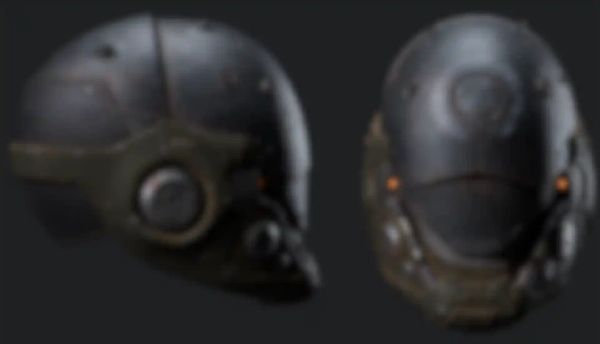
Marek: To create the helmet model, I began by sculpting a rough base using ZBrush. Then, I refined the mesh in 3ds Max and created the UV maps in Rizom UV. I used a base character model imported from Daz Studio and used Mixamo to generate an automatically rigged character with a walk cycle animation. Clothing was created with Marvelous Designer.
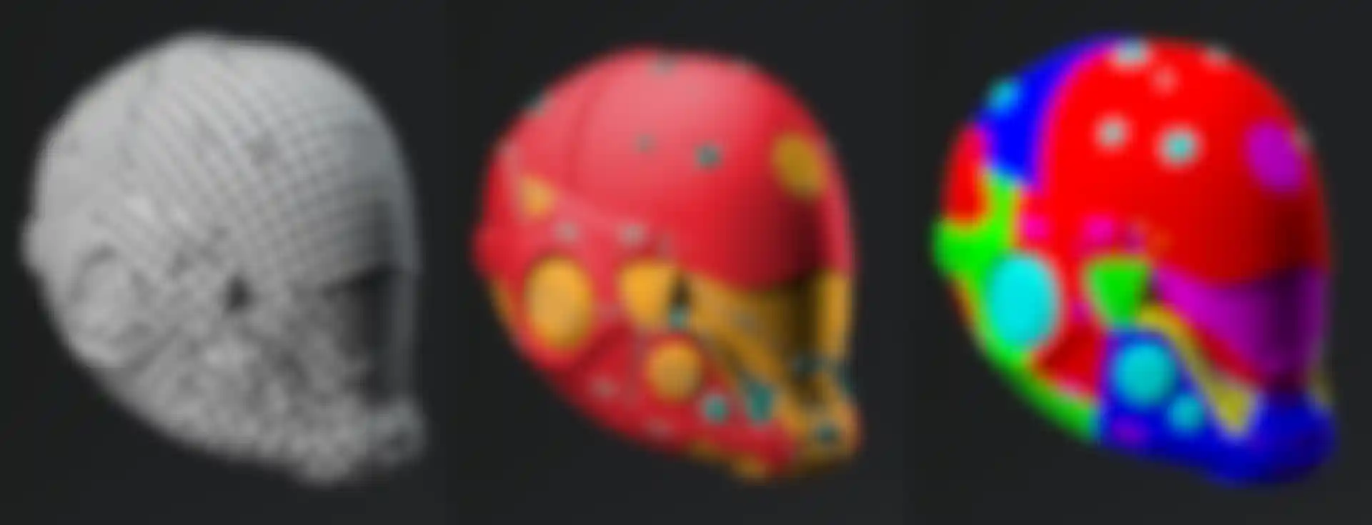
I blended different materials from the Substance 3D assets library in Substance Painter, using procedural masks and other techniques to achieve a worn-out look with some details. Adding some decals helped to enhance the feeling of functionality, and then I exported my textures to Cinema 4D and created new Redshift materials.
Please tell us about the fictional control panels you created.
Marek: Every procedural material from the Substance 3D library has multiple parameters, so I thought using fictional control panels with a variety of dials, switches, buttons and screens might be a good way to represent those. I began by searching for references where similar objects might exist, such as airplane cockpits, nuclear power plants, control rooms and so on.
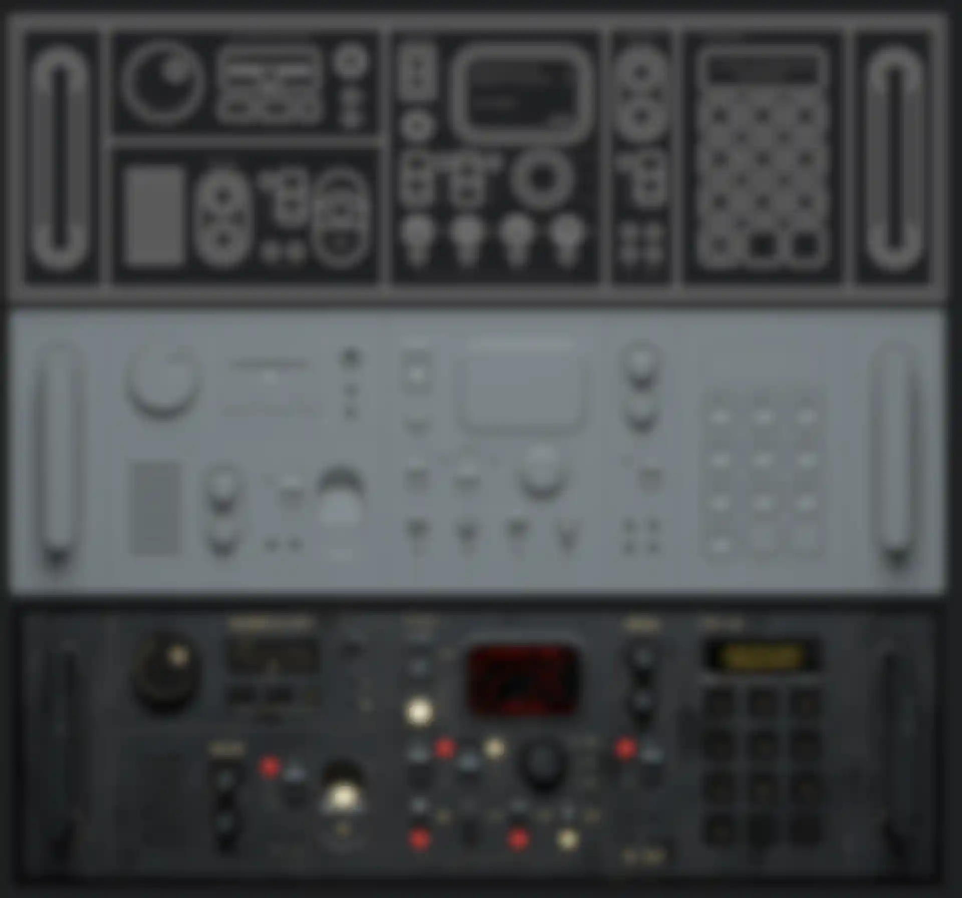
Based on those references, I started concepting and organizing individual control panel elements in Adobe Illustrator, and then I modeled them in 3ds Max. The key strategy was to divide a single panel into modules that could be rearranged easily to create different variations.
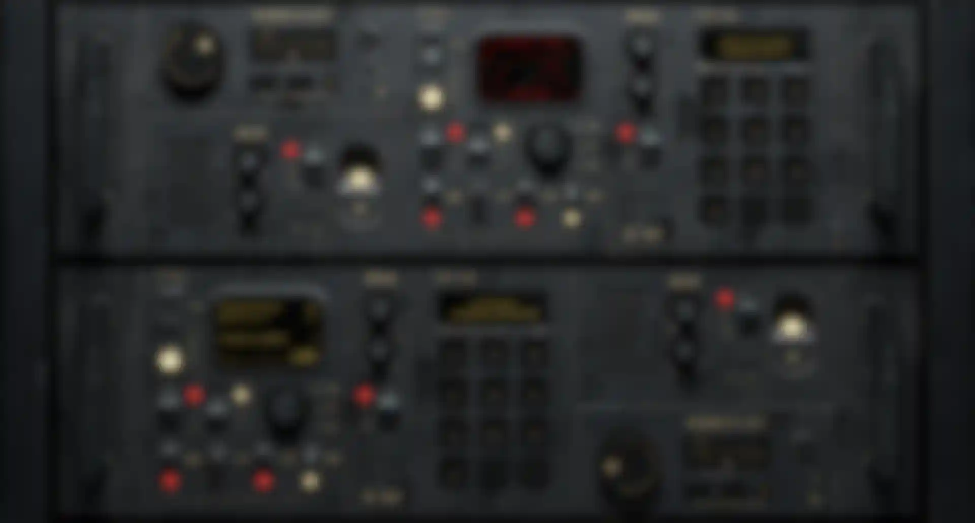
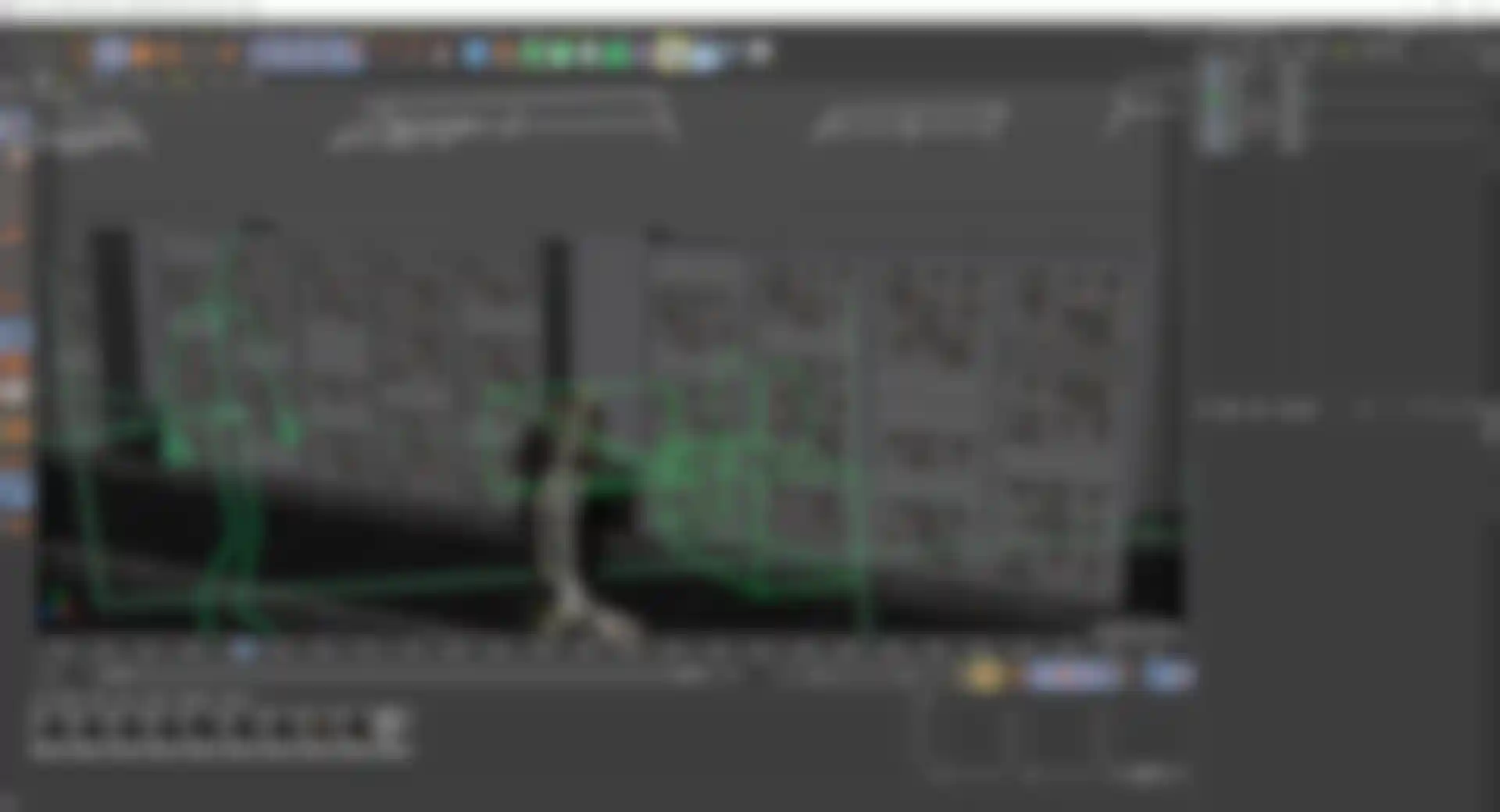
Next, I used the Cloner object in Cinema 4D to procedurally arrange the various panels and create an entire shelf. That allowed me to create different variants of a single shelf, so all I had to do was change the seed value in the Cloner to change the order of the panels.
Describe how you brought everything together for the looping animation.
Marek: In the final stage of the project, I used Cinema 4D to assemble everything, light the scene and develop the camera animation. The main challenge was creating the seamless loop.
I employed several techniques to make the looping animation work correctly, including extending the background panels on either end of the wall to ensure that the scene lighting and shadows were consistent from beginning to end. And the cloned control panel set up allowed me to place them at specific intervals. It was essential that the first and last frames were identical to allow the seamless loop to work.
Redshift area lights enhanced the character and created contrast with the background, and I placed them so the lighting at the beginning and end of the loop matched, making the transition seamless.
Adobe found you after seeing your personal work. Do you do a lot of personal projects?
Marek: I believe that personal projects that come from passion are super important. They tend to be more authentic and can attract potential clients because they showcase the artist's unique skills and creativity. What's more, personal projects allow artists to experiment and take risks without the pressure of specific client needs and requirements, which can lead to new and interesting results.