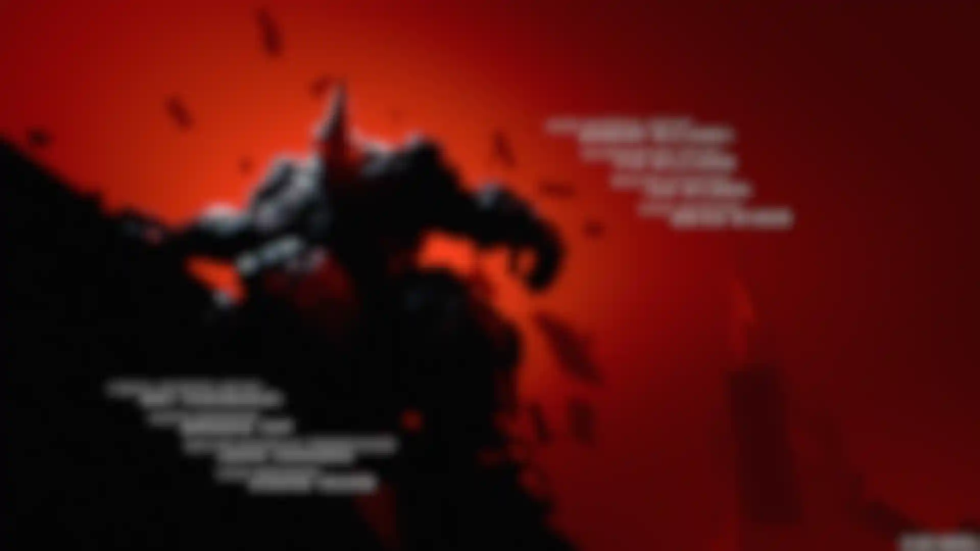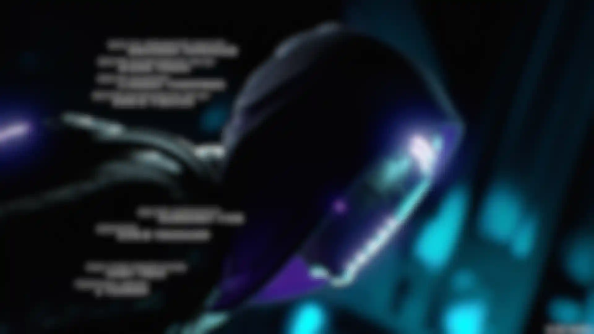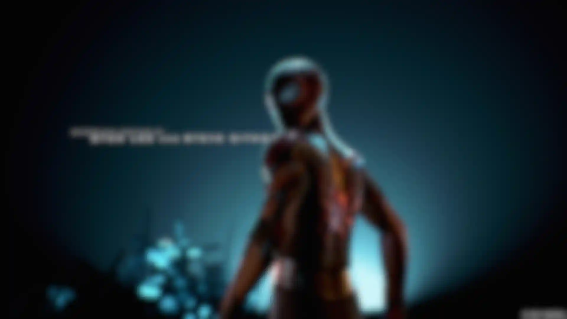
Spider-Man: Miles Morales Territory Studio explains the titles they created for an explosive game in the Spider-Man Universe.
Dynamic vignettes tap classic comic strip-styling and hyper-real cinematic techniques to celebrate the story of “Spider-Man: Miles Morales,” an action-adventure game in the Spider-Man Universe. Territory Studio’s motion design team used Cinema 4D, Maya, Red Giant tools, After Effects and Redshift to bring the action-packed tableau to life.
With their textured worlds, complex characters and interactive physicality, game titles marry well with Territory’s emphasis on storytelling and world creation through design, says Territory Creative Director Andrew Popplestone. So, when the studio won the brief to create the ‘Spider-Man: Miles Morales’ main on-end titles, the team was excited to be part of that new journey and to “put our unique Territory stamp on the project.”
Behind the Scenes
With a ten-week turnaround, Popplestone and Creative Lead Dan Herlihy led a team of five artists to deliver the three-minute sequence in 4K. “We were asked to create a celebratory retrospective of the players’ experience,” Popplestone recalls. “The client wanted to retain the look and feel of the characters and figures as seen in the game, but we were free to interpret the visual narrative.”
The final route evolved across a series of conversations with the client, in which the team harnessed Cinema 4D’s Take System, one of Popplestone’s favorite features, to spearhead creative discussions. “In game design, a balance needs to be struck between functionality, player experience and synchronicity with the overall graphical language of the game itself,” he says.
The concept for the title cards explored color as a tool to reflect the different strands of Miles’ teenage life versus his superhero life as experienced in the game play. So the team developed a graphic, beautiful and bold creative route with stylized environments and dramatic lighting and camera angles.”
Because the game and titles were in development simultaneously, there was constant dialogue between the team, Insomniac Games and Sony Interactive Entertainment about how to use various assets. The credit list was also challenging because it was constantly updating.
Those changes affected the flow, timing and length of the sequence, requiring the team to work out the mathematics of how long to hold on each card, how long to allow each transition between scenes and how to intersperse the color realms that all followed the same interconnecting narrative thread.
To resolve the challenges of workflow and delivery timings without compromising the creative, the team had to be imaginative, versatile and pragmatic about using reference assets. “Using Cinema 4D to map out scenes in pre-production, we came up with the idea of revealing the scene slowly, from close-up to mid and then a wide angle, meaning that you’re getting a lot from one scene and teasing out the storytelling nicely,” Popplestone explains.
Optimizing the workflow
Combining elements of their VFX and motion design pipelines, the team used Cinema 4D with Redshift to inject complexity and bring physicality and texture to the visual story. “Cinema 4D was essential to the entirety of the project,” Herlihy says. “With title design, it is important to be able to iterate quickly and efficiently. That’s precisely why we used Redshift’s GPU-accelerated renderer from the get-go and made sure we had builds in which we could adapt our Redshift set-ups quickly and effectively.”
Insomniac Games provided Territory with rigged characters and other in-game 3D objects in Maya. Once posed, the team exported the figures into a Cinema 4D scene as an OBJ and set up our cameras along with lighting, shading and final render. Compositing was done in After Effects, extracting the camera info from the Cinema 4D scenes.
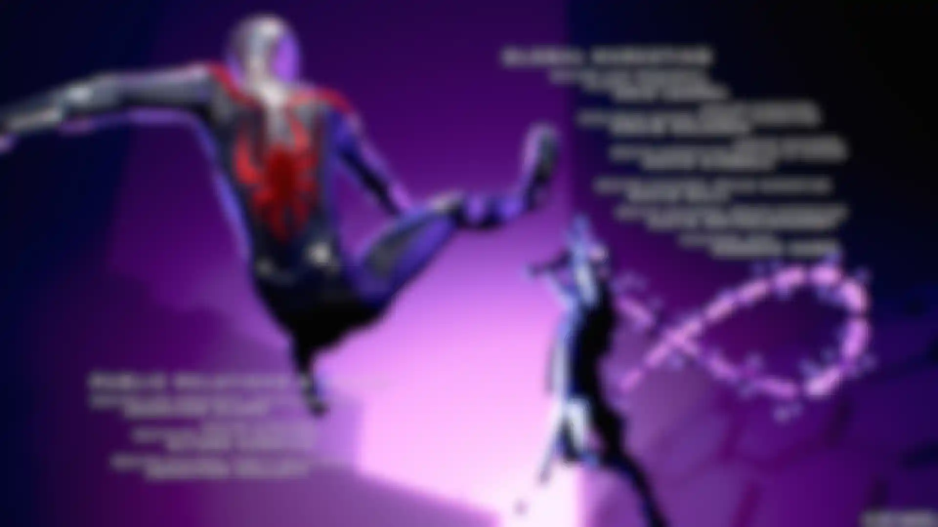
“We built out atmospheric elements,” he explains. “And we also incorporated Redshift’s environment pass in our comp setup and it was essential in framing our character silhouettes and forming our graphic-novel inspired compositions.”
Supplied with duotone lighting references that the client was keen to push, Popplestone says the differentiation between the lighting setups was designed to echo the different worlds Miles has to navigate throughout the game, from heroic action scenes to warm teenage moments.
“Redshift’s Object Tags helped us isolate certain materials and characters to be able to carve out the scenes, giving us an extra level of control,” he explains. “We needed to strike a balance between capturing the duolit tone that the client wanted to hit but also be faithful to the Spider-Man IP.”
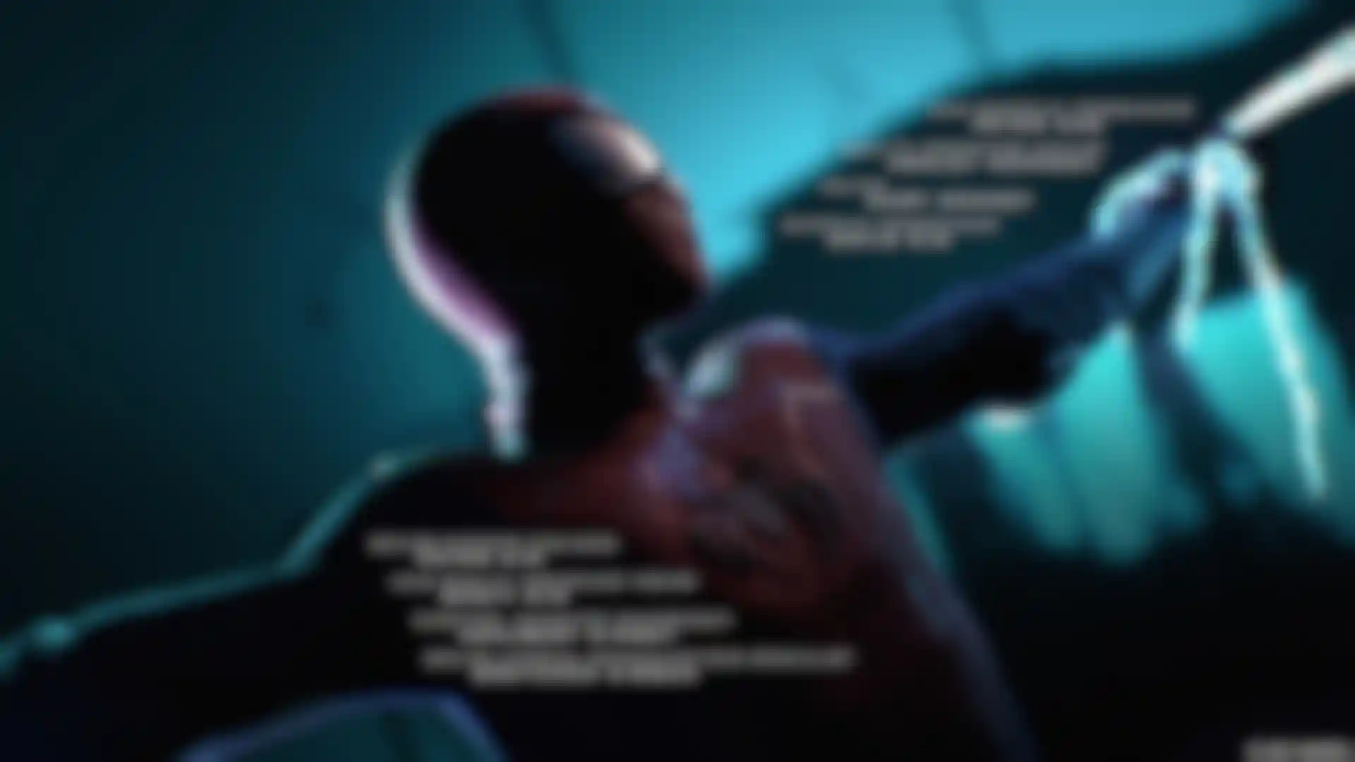
This meant isolating certain red elements in Miles’ suit via cryptomattes, so the vibrancy of those reds could be punched in post. “It was important for us internally to keep a dialogue with our 3D artists and comp team so that we had the ability to do this whenever needed,” adds Popplestone. “We engineered our glints in the highlights by simply adding a Red Giant Optical Glow on our reflective pass.”
“Studying graphic novels was an important part of the process as we wanted to sell the shot with as minimal amount of information as possible,” Herlihy says. Cinema 4D’s Target was used to make sure the silhouette was not overly lit at any one stage. And being able to control the lighting with Redshift Object Tags allowed the team to transition through multiple lighting setups.

Adding drama and hyper-real detail
Dramatic scene transitions were used to reflect classic comic-book styling, Herlihy explains: “The Pose Morph tool was essential to the project, allowing us to deep dive into the animation curves to convey the bullet-time feel.
By selecting the most dramatic dip in the camera animation curve and simply turning one off and the next on we were able to transition a scene to a different setup in one camera move. It sounds simple but to make it feel seamless it took some back and forth.”
Achieving the right level of detail was another challenge. “We were supplied with some references, and it was up to us how we wanted to frame, animate and design each story beat, essentially completely reconstructing key scenes,” Herlighy explains.
“In rebuilding and posing the characters, we had to recreate certain textures if the camera was super close to the model itself, and we sometimes built a bespoke shader to reflect the detail. Aesthetically, we wanted to head towards a hyper-real look and Redshift’s advanced shader network was integral to successfully injecting the right level of detail.”
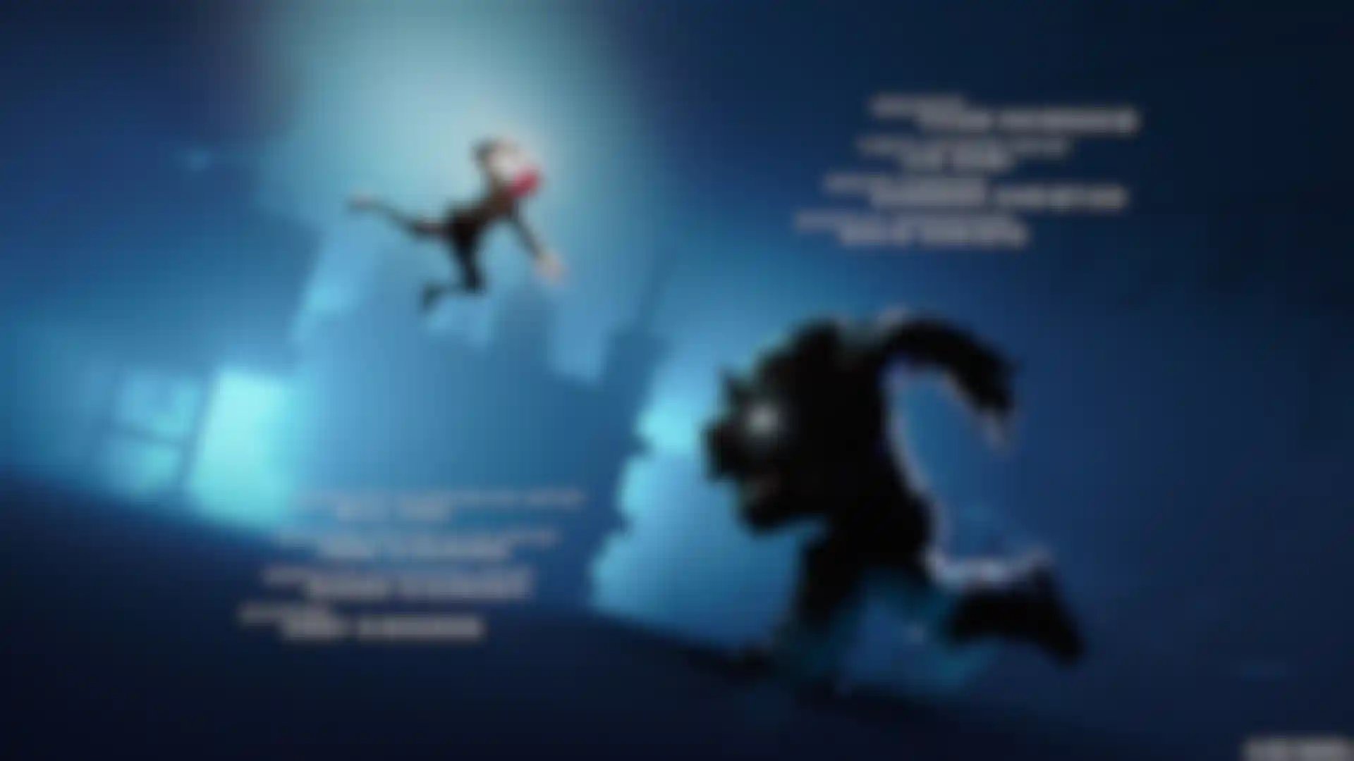
In a fitting tribute to the huge team of producers and developers that made the game possible, Territory aimed to create the titles with the same level of craft and care that distinguishes the game play. “I think we’re really proud of where we ended up in terms of the look,” says Popplestone. “Having worked across different Spider-Man properties, with each new iteration you feel you’re on a new journey with the client and the character. You feel part of the evolution, and that’s really satisfying.”


