Game Time for Xbox Game Pass Blind explains the 3D adventure they created for Xbox Game Pass’ E3 show.
In 2018, for the fourth year in a row, Microsoft and the Ayzenberg Group tapped Los Angeles-based design and brand strategy studio Blind to create content for their high-profile E3 (Electronic Entertainment Expo) show. While last year’s project was devoted to the launch of the Xbox One X, this year’s goal was to highlight Microsoft’s monthly subscription service, Xbox Game Pass.
Blind’s challenge was two-fold: Create something fun and engaging that amps up excitement about Xbox’s subscription service while also announcing current and upcoming games in some kind of creative way. Collaborating closely with the Ayzenberg Group, Blind’s team, led by Creative Director Matthew Encina, used Maxon’s Cinema 4D, After Effects, Octane and Red Shift to create a narrative that builds on Xbox Game Pass’s current drive-thru-themed marketing campaign.
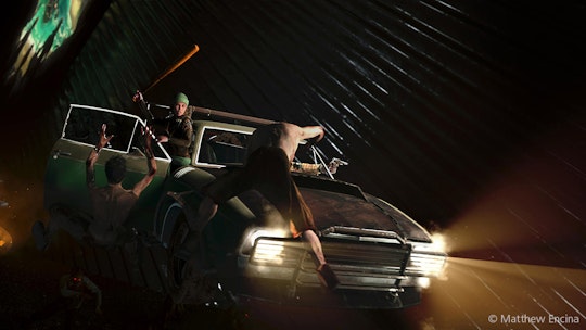
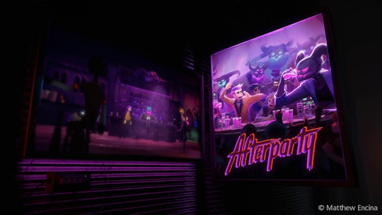
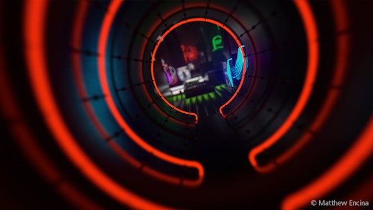
The result brings the drive-thru to life, taking viewers on an animated, 3D adventure past glowing neon signs and game art featuring some of Xbox Game Pass’ current offerings, as well as action-packed dioramas showing off games coming soon to the catalog. I asked Matthew Encina and John Robson, who served as associate creative directors on the project, to explain how they dreamed up and executed the captivating project, which took intense coordination among many different teams.
Matt, can you talk about your process for dreaming up the kinds of things you do at Blind?
Encina: Sure, my process is definitely something I’ve developed over time. I think that anytime you’re designing you are problem solving. And it’s not an art: It’s a science. I mean, there’s artistry in it, of course, but design is an objective process and you have to drill down to solve key problems. Blind’s Executive Creative Director, Chris Do, has taught me that you need to make sure you understand things like: What is the goal? What are the challenges? Who is the audience? Once we understand those things, we know that whatever we make will be useful for the client. Then we move on to define the creative parameters.
From the very first creative kickoff meeting with the client, I try to box in the creative. I find creativity in limitation, so I try to determine a very small box defining what the creative can and cannot be. I don’t like it when anything is possible because then everything is possible, and that is too daunting. Narrowing down allows me to focus 100 percent of my attention on one idea, rather than 1 percent on 100 ideas. (Watch Encina’s video on creating his presentation for Maxon’s 2018 SIGGRAPH booth.)
Once you decided on a narrative for this, where did you go from there?
Encina: To visualize the aesthetic, I first designed frames in Cinema 4D and Octane so I could get an idea of the overall look and also some of the key moments. After that I worked with a storyboard artist to create the sequence, and then I teamed up with John Robson to do the animatic. I’ve been working with John since 2006, and the good thing about him is that he has more of a film background, and I have more of a design background and we really push each other throughout the process.
If I can dream up a story, John can come up with ways to do it using C4D and third-party plug-ins. He’s always the guy who pushes me to try something new. I can be pretty simple in terms of the tools I use but John is always experimenting on the fringe and pushes us to adopt new tools and techniques. From there, I just scale up and build the team and hardware according to the specific needs of the project.
John, talk about your role in this project and what you tried that was new.
Robson: There’s definitely been an evolution of how Matt and I work together. We push each other, and with this project, the client knows our potential and wanted to push the bar further too. Matt did some really beautiful style frames and we worked together to come up with ways to expand the drive-thru theme into more of a roller coaster ride. That’s how we came up with the idea for the dioramas. Those were fun, beautiful moments that felt like they were trapped in time. I really like the sense of realism and scale, which makes them feel less CG and more tactile.
The new technology we tried for this project was Redshift. We worked in 4K and with Redshift. We were able to optimize our scenes and get through everything really fast. We were able to add so much more detail and volumetric lighting. But another big thing was that we didn’t have pre-rendered elements from the client. We were able to bring in all of the assets from the different game companies and texture and light them to the level we needed on a really tight deadline. Back in the day, it took so many more steps and technical knowledge to create something that was in your head. Some of these shots only took a week from start to finish and they turned out beautifully.
Describe how you brought your team together and how you worked with others.
Encina: Our process is often the same for a lot of what we do. We try to keep the team as small as possible during development. Once the idea and technique are clear, we build the team based on what we need. For this project, it was me and a few designers at the beginning, and then I brought on John to flesh things out. Then, in the last half of the project, we brought on six Cinema 4D artists and a Maya artist to get us to the finish line.
We like to work that way because it allows us to spend our money very wisely. Our team always stays objective, always tries to do right by our clients and we serve the best creative we can cook up.
