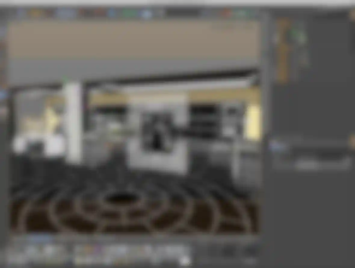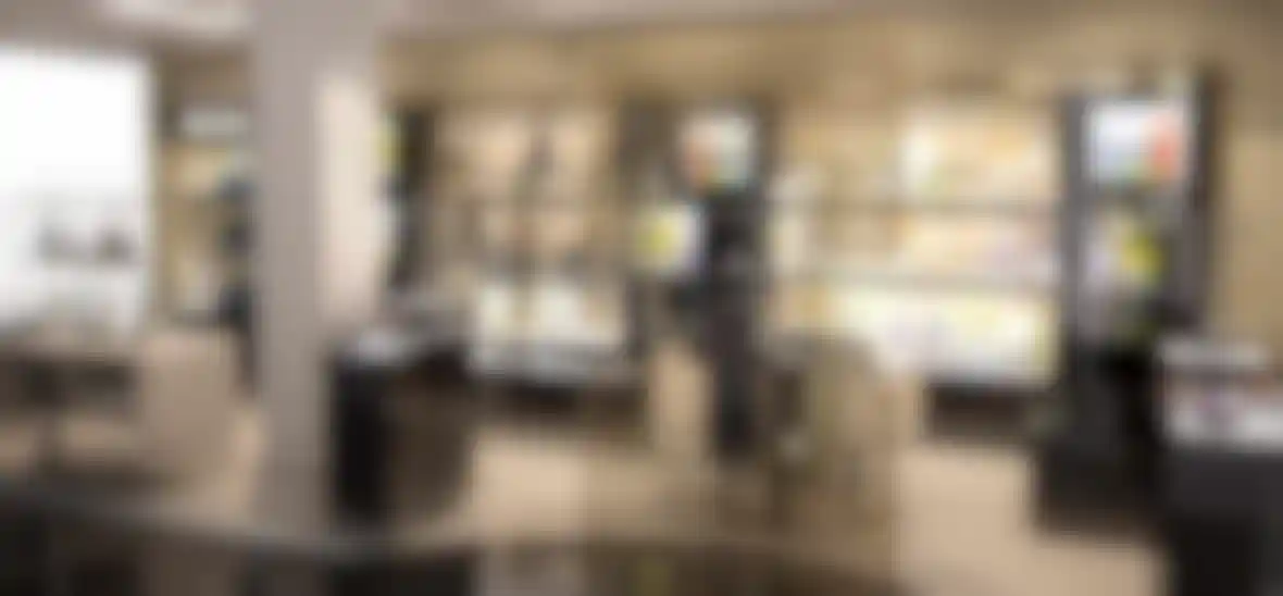
Creating a Luxury Space When Scardigno Design was asked to design a retail concession in Harrods, Cinema 4D was called upon to create the visuals that balanced upmarket looks with available floor space.
Greggio is primarily an Italian wholesale business dedicated to creating upmarket silverware and jewelry, so when the company had the opportunity to move into a retail concession in the Harrods store in London, it turned to Nick Scardigno of Scardigno Design for visualizations first. Nick explained, "The design brief was quite an open one. They wanted an environment that would complement their product, not compete with it, and that conveyed a sense of luxury and authority."
Easier said than done, though, because the actual floor space in Harrods was quite small, making it a challenge to balance room for the products and space for people to actually walk around and see them. Nick described how he approached the problem: "The floor space was very limited, especially when working with Harrods' strict guidelines. We wanted to obviously get as much of the Greggio product out on display as possible, but also to make shopping the space an easy experience. All of the site dimensions were supplied by Harrods in advance, and the space was carefully planned to make sure that everyone's needs were met."
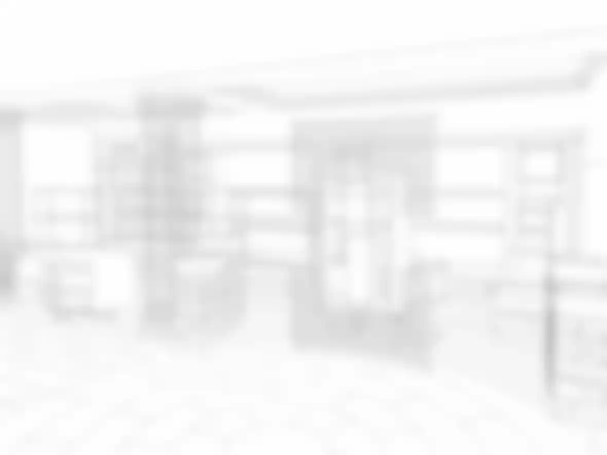
The first stage was to produce a series of sketched visuals, using Cinema 4D's Sketch and Toon, to give an overall view of the design concept. Once this was approved Nick started work on creating the photo-quality versions, starting with products to put on the shelves. The plates were done using plane objects with pictures from the Greggio catalog applied to them. Up close, this type of object tended to look a little flat, but from a distance they worked out exactly as Nick had hoped they would.
Nick modeled the picture frames himself, and then added a little personal touch, "I even sneaked in a photo of my daughter into the picture frames - I always try to get a picture of her into my renders!"
Populating the shelves with products could have been a time-consuming, not to say tiresome, job but this is where Cinema 4D's Cloner tool came into play. Nick explained how it was used, "I loaded up a selection of the product into a Cloner object and used the randomize setting to make sure that different products ended up on different fixtures. By adding a random effector to slightly adjust the position and rotation of the elements, I managed to get a very natural spread of product on the fixtures that did not repeat or look obvious."
One part of the visualisation has a cloth laid over a table. In order to make it look more realistic, the cloth simulator in Cinema 4D was used to create some deformation where it hung down. It took a little bit of experimentation, but the end result was more natural.
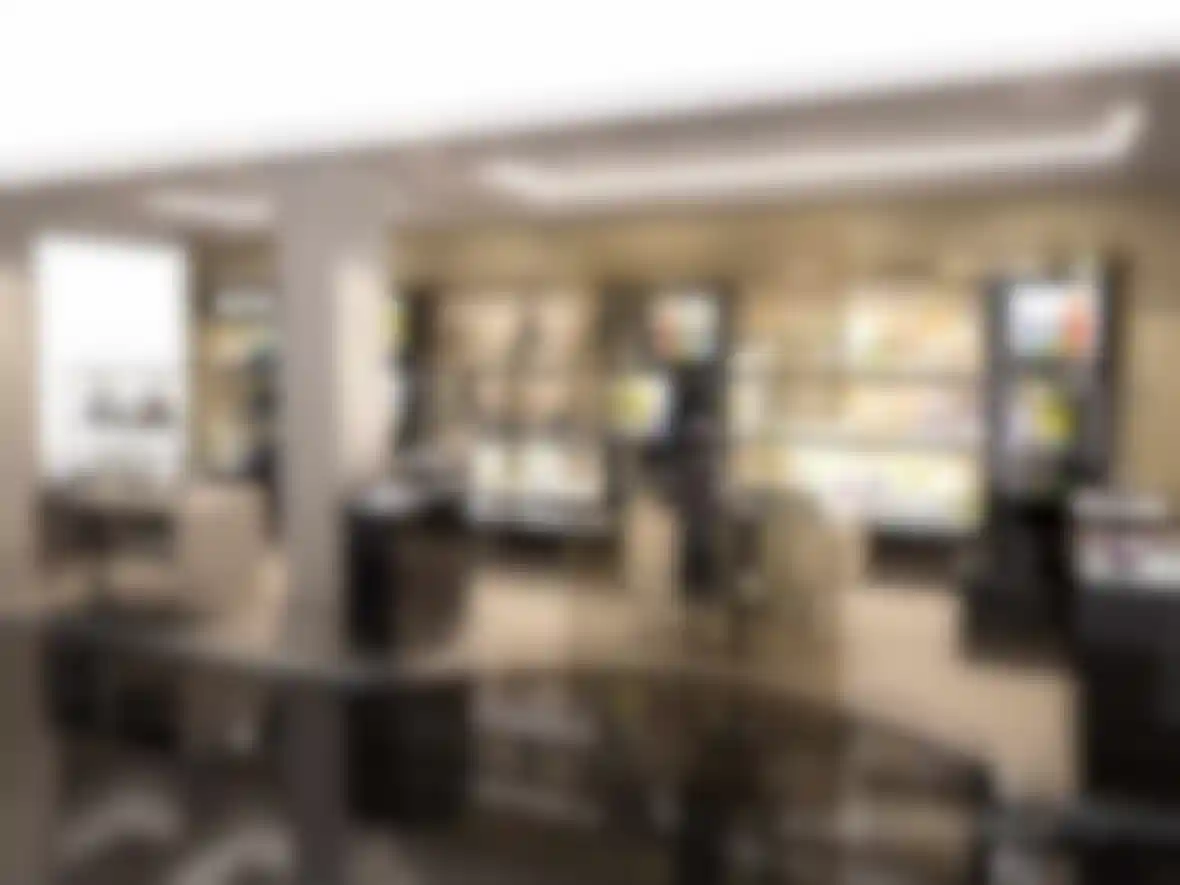
One of the interesting comparisons to be made from the Scardigno visualizations and photographs of the actual retail space once built, is that the black bricks on the columns and product supports, and the floor tiles, look exactly like the real-life concession. Nick detailed the process he went through to achieve this look, "I photographed some marble I found on the outside of a building, and tidied up the picture in Photoshop to create the flooring. The black lacquer material was done using a simple color, and adding a Fresnel shader into the Reflection channel. The smallest amount of bump, and a bevel to all of the corners, gives a very slight imperfection to the finish, and really goes a long way to making the finish look as it will in real life."

The actual store is festooned with spotlights, so here the design needed a similar kind of result without going overboard and making the rendering engine overloaded with raytracing huge numbers of lights. In the end, IES lighting was used for the highlights, but the environmental reflections were done using one of the stock HDRI files that ship with CINEMA 4D. Even so, when Nick started rendering the 1680x1260 resolution files with 103k polygons, his MacBook started to struggle, and he only had a week to work on the project. Fortunately, he was able to send the files off to a render farm for a quick turnaround.
The end result was a success, though, as the client thought he was showing them actual photographs of a previous project when he presented the final visuals. As Nick concluded, "nothing comes close to Cinema 4D for its ease of use and awesome end results." The Greggio retail space is now up and running in Harrods, so you can see for yourself how it compares.
Scardigno Design website:
www.scardigno.co.uk
Greggio website:
www.greggio.it
