ITV Creates' with Cinema 4D and Redshift For ITV Network's gargantuan creative graphics project, DBLG used Cinema 4D and Redshift to produce a series of stylish animations
Independent British television network ITV has been operating since 1955, and in that time has undergone many changes to its brand and personality. For 2019, it launched a new initiative called 'ITV Creates.' This ambitious, year-long project features a new on-screen ident every week. A variety of artists were commissioned to generate the 52 idents. As a means of representing the network's commitment to creativity, each of the chosen artists produced their own interpretation of the ITV logo.
With idents changing on a weekly basis, ITV also needed a new on-screen presentation system to anchor it all and provide some consistency. For this they turned to regular collaborator, London agency DBLG.
Grant Gilbert, founder and creative director of DBLG, explains how the job came about: “We’ve worked for a number of years with ITV and have a great relationship with their executive creative director, Tony Pipes. We heard about ‘ITV Creates’ and obviously as part of this rebrand they needed to refresh the on-screen presentation system, and that’s when we were asked to come up with some new design thoughts.”
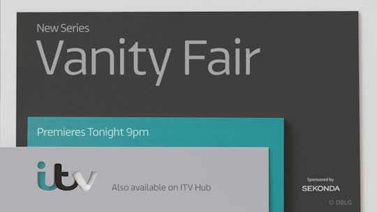
The team was tasked with updating the on-screen presentation system to bring it more in line with the new idents; something physical and tactile was required. “That’s when we came up with the design, which also updated the master logo into three layers. This was designed to work throughout the junction across all areas of promotion: credit squeezes, promo end boards, lower thirds, cross-channel promotion, bumpers and all off-air elements.”
The resulting concept is elegant and eye-catching. It consists of three textured boards with segments cut out of them, which fall realistically and line up to reveal the ITV logo. In all, DBLG created 24 different animations for the bumpers that bookend commercial ad breaks.
Each of the panels was designed in Adobe Illustrator, then modeled and textured in Cinema 4D. To give the panels a physical aesthetic, they’re textured to look like card and painted wood, with a texture map used to show layers of plywood. With the textures in place, the colors were simply changed between the different animations. The various color schemes were inspired by the five main colors of the ITV logo, which had undergone a major rebrand in 2012 courtesy of Rudd Studios.
The key element of the project is getting the cards to fall just right, so that the cut-out lettering lines up. “It took us a few weeks to get this move right,” admits Gilbert. “First of all, we made a physical model of the panels using wood and plastics that we hinged together with tape to see how it would really move. We wanted it to feel like a human was involved in the move rather than a computer. For example, we didn’t want the letters to fit together perfectly, we wanted them to be slightly off-center. That makes it look more realistic.”
Once the team had determined the look of the movement, the animation was done using Cinema 4D’s built-in dynamics system.
Some of the moving panels needed text to be added relevant to the programming. To achieve this, nulls were added to the geometry to track the type. These were then exported as an FBX file for use in the Pixel Power Clarity graphics system. Artists at ITV could then quickly update the text as necessary.
The level of realism was also helped by using the GPU-accelerated renderer Redshift, which was recently acquired by Maxon. Built to meet the specific demands of contemporary high-end production rendering, Redshift has rapidly found favor across VFX and motion graphics studios for its speed and flexibility. “Redshift really helped us work quickly so we could get the look we were after,” says Gilbert.


