The Titan Games The Other House on branding and designing for an epic sports competition series.
Portland Oregon-based boutique motion/production studio The Other House has worked on numerous broadcast branding projects over the years. But their recent collaboration for the network’s new sports competition series, The Titan Games, was among the largest and most challenging.
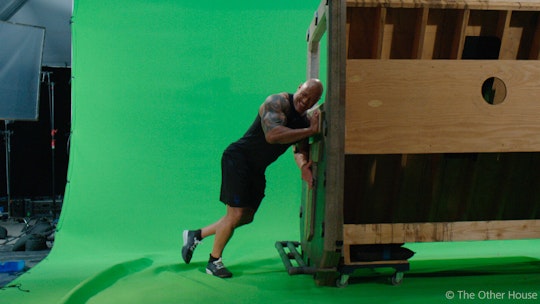
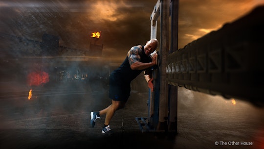
Working on the show for over a year, The Other House primarily relied on Maxon's Cinema 4D. And they were involved with everything from initial logo development through shooting and post. It was a great opportunity for the company to show what they can do for a prime-time broadcast series, says Chris Roth, The Other House's executive director and principal animator. "It really tapped into many of our creative specialties from logo and brand development to big, sporty broadcast graphics. And the show also features a lot of techy info-graphics and a good deal of high-end VFX compositing challenges."
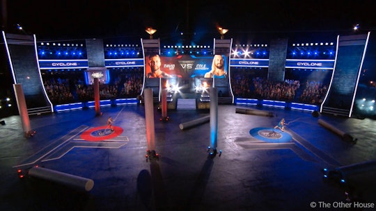
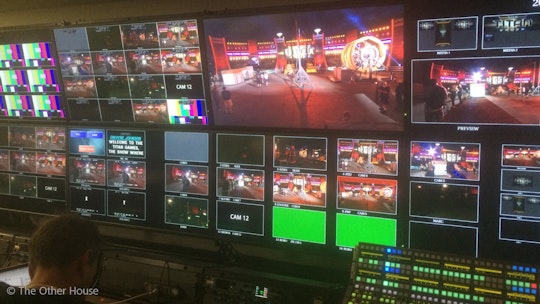
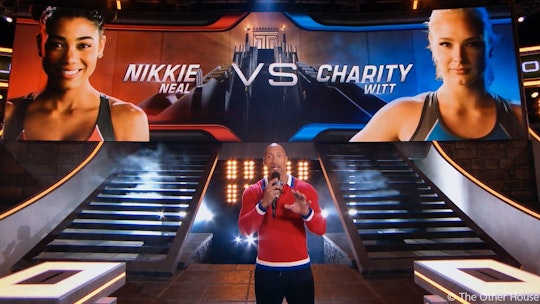
While the process for creating the 10-episode series was intense, it helped that The Other House team was on-site for the load-in and live taping. Working closely with producers and Director Alex Rudzinski, they collaborated on blocking out show sequences, so the graphics and live elements supported each other cohesively. Roth and two additional designers at The Other House, Adam Gross and Andrew Nicolai, also spent nearly three weeks on-site working around the clock to develop and format stylized graphics for the nearly 20 integrated LED jumbotron screens offering information and stats about the competitors and game challenges.
Branding a New Kind of Sports Series
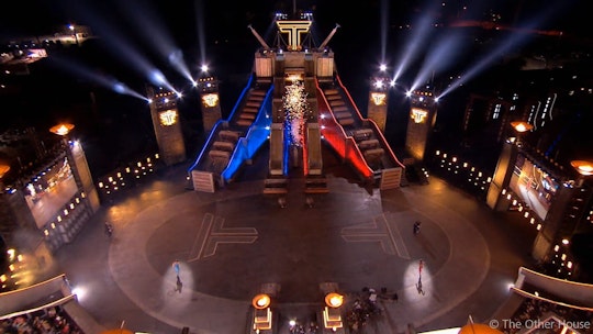
Based on Johnson's desire to push everyday athletes to reach their full potential, The Titan Games, offers competitors a chance to step into the Titan arena and tackle mental and physical challenges designed by Johnson. Branding the series was tricky for many reasons, Roth recalls. Because the series was still in development when The Other House began creating design options, his team's work needed to evolve along with the show. Early ideas were inspired primarily by traditional sports graphics. But that American Ninja Warriors' sports sensibility didn't quite fit as the arena took on more of an epic Roman colosseum fantasy look. Set development mixed things up even more with a variety of high-tech feature revisions that introduced a Tron-like futuristic vibe.
Designing the logo and screen graphics
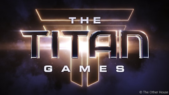
Using Cinema 4D, Roth and his team went through many iterations of the logo before coming up with the final design. "A huge part of the process is letting go," says Roth. "We work very hard deriving logo marks and producing a number of successful designs. But if and when the show's creative evolves, we have to evolve with it. I liken it to the scientific method, data might point to a strong conclusion, but if new data is introduced that contradicts it, it's back to the drawing board."
Knowing they needed an iconic emblem for the show, The Other House explored various T and TG forms, finally settling on a single T inspired by the columns found in the Colosseum in Rome and tweaked to have a more modern feel.
Keeping Things Fresh
Though Chris and his brother Steve, along with their wives, Amber and Lara, launched The Other House just six years ago, all four of them had been working in the industry for over a decade so they brought a lot of experience and contacts to their new company. "We are a pretty boutique operation with strong roots," Roth says. "Besides the family element, my three lead designers are all friends I met at Parsons School of Design over 20 years ago." Year after year, as The Other House keeps getting busier with an increasing number of exciting projects, Roth believes one of the keys to their success is a commitment to taking every aspect of a project seriously.
And one of the best things about branding projects is that each one is a different and exciting puzzle. "I'm really grateful that we're not pigeonholed to a narrow design aesthetic," he says. "We're always working on several different shows at the same time, and they're all wildly different in concept and demographic. It's refreshing and allows us to continue to keep growing creatively."
