Ballantine's Whisky Reveals Secrets in CG How Cinema 4D helped Found create the ambitious "Too Good to Hide" campaign.
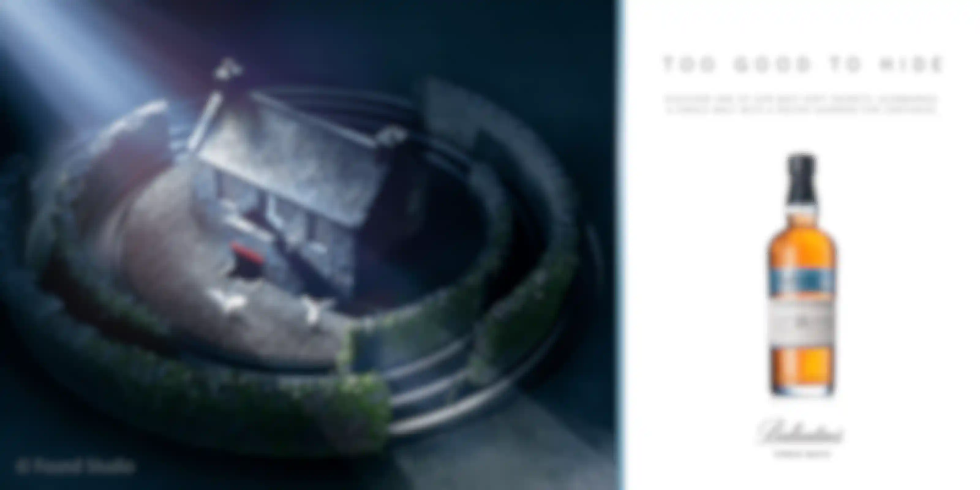
Ballantine's scotch whisky has been around for nearly two hundred years, and what goes into its famous blends has been a closely guarded secret. Recently, the company offered a peek behind the curtain with a new campaign called "Too Good to Hide." Created by London-based motion studio, Found, and the integrated creative agency, Cubo, the fully-CG film at the center of the campaign tells the story of three single malts from the famous Ballantine's blends, which are now available individually.
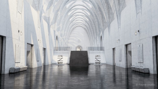
Built entirely in Cinema 4D, with support from additional software and plugins, Found worked with Cubo to create the ambitious, two-minute film, which begins inside the fictitious House of Ballantine's before exploring some of the unique qualities of the Miltonduff, Glenburgie and Glentauchers distilleries.
In addition to the film, Found's team was also responsible for making cutdowns and social assets, as well as collaborating with Cubo on related digital and print elements. I talked with Found Creative Director and Founding Partner, Mike Sharpe, and Art Director/Senior Animator, Ryan Locke, about their 3D approach to what was originally conceived as a live-action film. Here is what they said:
Why did Cubo choose Found to collaborate with on this project?
Mike Sharpe: We made a short film called Mondegreen, they saw it and called us to talk about the project. It’s always really great to have a personal project transform into studio commercial work, and you can definitely see correlations between Mondegreen and what we did for Ballantine’s.
How did they explain what they wanted when you talked?
M.S.: The film was originally conceived from a live-action perspective, and they wanted us to check their idea and offer thoughts. We have a lot of experience in live-action, but we also do a lot of photo-real motion design nowadays. Their creative team walked us step-by-step through the film, which was moving from location to location. We thought it sounded incredible. But, given the sheer amount of locations and setups required, we recommended doing it in CGI.
Everyone agreed, and they explained that the film was the hero piece for a larger campaign, so we also needed to deliver stand-alone films, social media assets and all of the imagery for the print campaign. The print assets have a much sharper, cleaner look than the motion elements, which are trying to emulate the texture of film. Often, we would take each scene from the film and render it at a much higher fidelity and pixel count to get the crisp look we wanted.
Describe your process for working on this.
M.S.: Cubo had a brilliant idea for this, and their script was great. We worked with them to make what they envisioned more of a seamless journey. We started with a storyboard showing them how we thought things should function in terms of the story. Then, we moved into doing an animatic to check timing and then previsualization. We always use Cinema 4D for previz. Going from the animatic to the previz is hugely important when you are testing camera moves and timing. I come from a live action background, and I love being able test everything in previz.
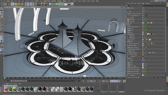
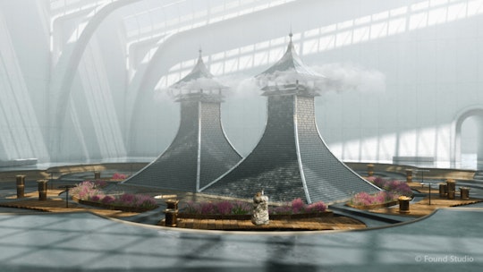
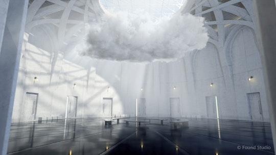
At the same time, we had a team of people modeling assets, and we also had a huge list of things we had to make, including the key brand icons, the water wheel, cottage and pagoda chimneys. All of the key images we modeled for the film are based on real locations at the three distilleries. The architectural design of the House of Ballantine’s took us the most time. We got a load of architecture references from around the world so we could design a building that looked and functioned the way we wanted it to. The culture at Found is that we like to see people’s fingerprints on jobs. We don’t want anyone to feel like they’re just an operator. So we sat down as a team and looked at all of the ideas on the table, and everybody chose to work on what was best suited to their skillset.
Ryan, talk a little bit about your role.
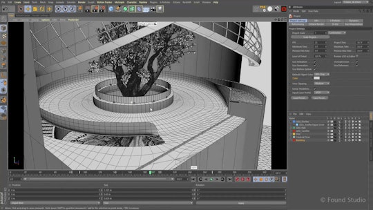
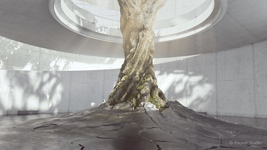
Ryan Locke: I worked on the storyboards and previz with Mike and led our animation team. I also did a lot of the architecture mockups. Often, whisky makes you think of darkness and dusty, oak barrels. But this film was for the Asian market where things have a lighter tone and are more modern. They wanted this to have a tradition-meets-modern feel, and the architecture in the tree room and the atrium inside the House of Ballantine’s represent that mix the most in the film.
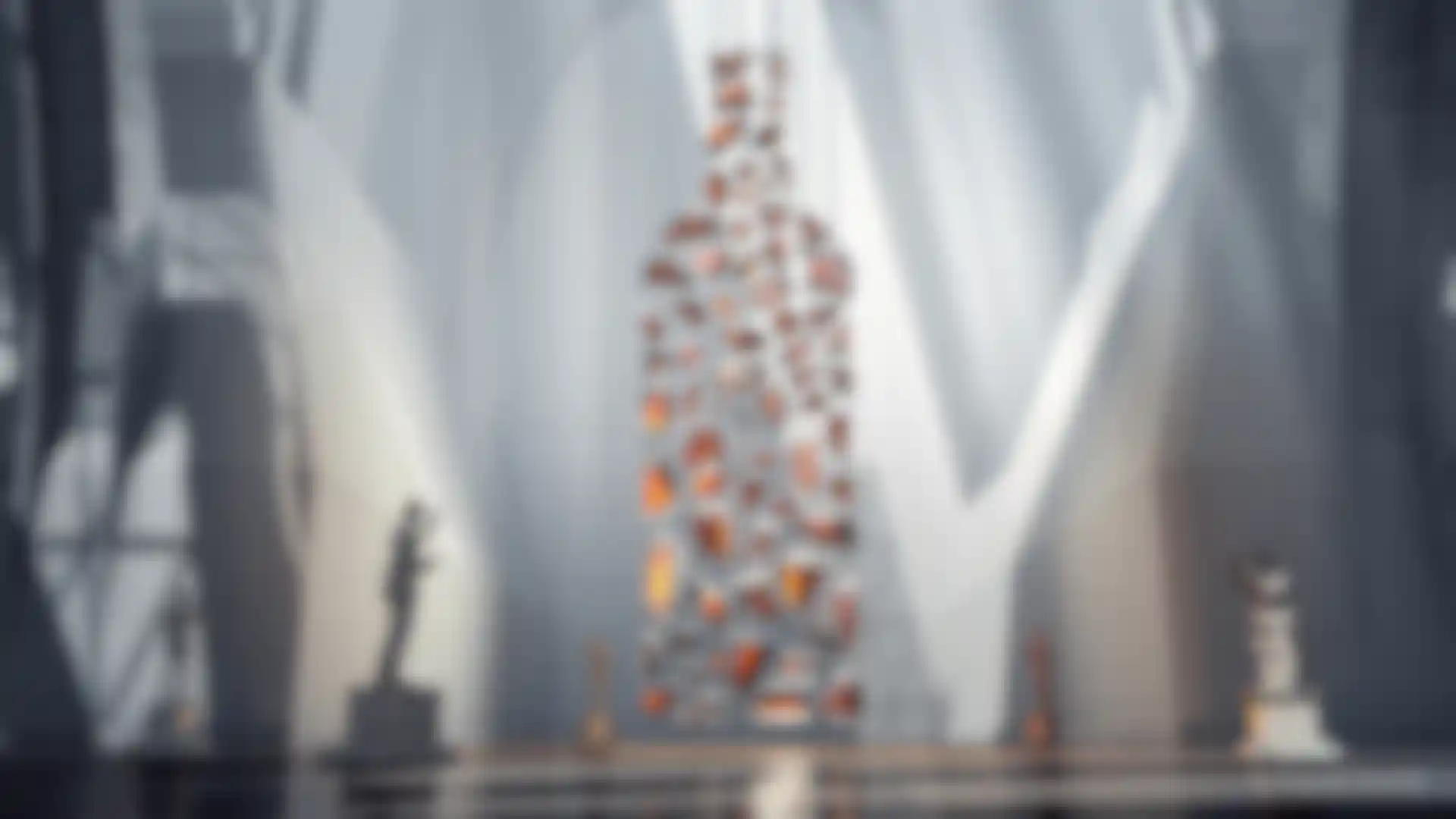
Talk about making the bottle scene with the sculptures of the five master blenders.
M.S.: That was a big challenge. The hanging shards of glass they are gathered around operate like an optical sculpture, so the camera could move around it. At one sweet spot it marries up and creates the shape of a whisky bottle, so we had to know the angle we were going to shoot from, or we would have had to reposition all of the pieces. We lit the room so that light would play across the glass.
R.L.: This was very technically challenging. Each of the vials is made of glass and contains liquid, so the render time to calculate all the reflection and refraction was colossal. We tried a few clever techniques to execute the parallax effect so everything would line up in the shape of the bottle but, in the end, the simplest thing was to position them all by eye.
The shots of the single malts in bottles look so realistic. How did you handle those?
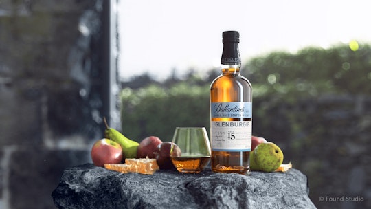
M.S.: Those CGI patch-ups have created a lot of conversation. Trying to match photography in CGI can be tricky. Modeling the bottles was pretty straightforward. But getting the lighting right, so we could show the label artwork correctly, took a lot of rounds. It also took a while to get the iridescent quality and color of the whisky right. Each single malt bottle has its own rock associated with it, so those needed to be modeled. We used some photogrammetry to get some of the flavor notes right.
Mike, you said Found is doing more motion design. What are you working on now?
M.S.: We used to do a lot of high-end, traditional filmmaking but the budgets for that have dwindled over the last couple of years. This was a great opportunity to make a film in a different way, and it’s a testament to Cinema 4D and motion design in general that we were able to make this the way we did. We’re currently in the process of making a whole new film for the “Too Good To Hide” campaign to promote the 18- and 23-year-old malts. This time, the film is set at night, which gives it a whole new look entirely. We’re having a lot of fun adding practical lights and reimagining scenes bathed in moonlight. It’s going to be beautiful.
