Creating the Personal Touch MPC's Motion Design Studio turned to Cinema 4D to explain the benefits of a digital lifestyle for Three Mobile customers.
MPC's Motion Design Studio, in collaboration with creative ad agency Boys and Girls and director Brett Foraker of production company RSA, was faced with the technical challenge of incorporating fast-moving CG elements into a single, 40-second camera take. The concept for the advert was, that through mobile phones everyone has access to many different digital applications. Conveying the benefits of having that digital lifestyle through the Three Mobile network was a challenge that started with HDRI and reference measurements taken on a cold street in Prague.
The hero figure of the film walks down a street, encountering other people and accessing social media, collecting music albums in Spotify, playing fantasy football and finally encountering a wall of Instagram photos.
The Motion Design Studio team, part of MPC, was lead by Eliot Hobdell with the efforts of 15 artists over a period of four weeks. Cinema 4D R14 Studio was used for all the 3D elements in the 40-second spot, with the final piece put together in NUKE and then polished off in Flame.
Eliot commented, "It took a lot of R&D and Look Dev to get it all working, with various technical hurdles to overcome. In particular, we developed a bespoke voxel effect for the fantasy football section as well as sculpting multiple dynamic simulations for the Instagram section at the end. For all sections, we tried a lot of different looks and approaches before we settled on the final treatment."
The main focus throughout the spot was to get the real world and the CG world interconnected in a realistic fashion. The VFX work needed to fit seamlessly around the hero, as well as provide a driving force behind his journey down the street. In order to achieve this, the hero's sightline and physical position were precisely measured to control how the CG elements were fitted around him. Eliot remarked, "The director, Brett Foraker, is extremely experienced in this kind of VFX work. We took his original treatment and storyboards and worked with him to develop the best techniques and toolsets to use."
The whole ad was a single-take shot, which created some challenges. The final take that was used was more than three seconds over length, and needed to be time-warped to match the required 40-second slot. This meant there were time-warping artifacts that had to be removed throughout the film. The Motion Design Studio pipeline had to accommodate this time-warp right from the start. So, the 3D camera track was created from the original plate and then the time-warp being used on the footage was applied to it. Lead Flame operator Franck Lambertz built a custom NUKE script to do this.
There were a number of technical challenges to overcome, starting with camera tracking and match-moving. These were particularly difficult for that section as there was a very shallow depth of field, a 180-degree camera swing and very little texture detail in the background. To overcome this, the camera track was done in sections that were then stitched together, mainly using Synth Eyes and PF track. As the hero walked along, the original concept was for the icons to form in the air around the hero's head, but this impacted on his performance, especially when he was talking.
Instead, director Brett Foraker suggested there be an enhancement of the phone screen, in a heads-up display style. So, over the course of a week, they looked at numerous ways for how the icons could be re-worked into this shot. The trick then was to make the icons feel like they were connected to the swing of the phone in the hero's hand while walking, but also moving in the air around him.
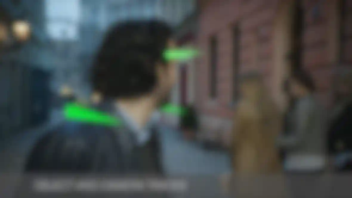
Having generated a camera track for the shot, the Motion Design Studio then used tracking markers placed on the hero to generate an object track of his movement in relation to the CG camera. This was then further adjusted by hand to give a tracking null for the movement of the icons that had a feel of them rolling with his body movement while also feeling connected to the phone that was out of shot. The other half of this section was as the hero encountered a group of young women, and this initiated the social media world. This showed the hero interacting with both women and the CG elements while adding someone to Facebook. The challenge here was tracking the geometry onto the hero's shoulder and rotating the jacket texture to create the voxel effect for the Facebook thumbs up. The geometry was match-moved and then Cinema 4D's MoGraph was used to fill the volume with cubes. These were animated with effectors.
One of the more laborious tasks was painting out the tracking markers on the actor's shoulders, arms and wrists, as well as the phone, for the first two sections of the shot for every frame of the 40-second advert. This was no fewer than 1,000 frames and, along with the markers, the body and hair of the hero had to be rotoscoped as well, while the entire street was modelled and geometry-matched. To round it off, there was also lighting, texturing and compositing.
Music has become increasingly digital and that's what has to be conveyed in the Spotify section. The idea was to enhance records that were dropped onto the set with CG extras. Also, the album cover that is actually caught in the shot, needed to be replaced and the sequence needed to be modified to show the albums breaking up into pixels as they came into contact with the floor. This is where Cinema 4D's aero/dynamics simulation and an XPresso script came into play. Manual animation was used to match digital doubles for the original records and an aerodynamics simulation was created for the extra records. A 2D planar track of album cover that the hero catches was created, and an XPresso script was set up to swap the covers with exploding MoGraph clones for the pixels when the records made contact with the floor plane.
This script also handled the swapping of the textures from the covers they were replacing. Of course, this did mean that the floor was then covered in albums that would have interfered with the next section with the footballers. To get round this, a digital matte painting of the floor was created and tracked into the shot.
One of the most challenging elements came next, as it featured fantasy football players as if they were pixelated computer game characters, running past the hero. Eliot explained the issues: "As time was short, we needed to develop a way of creating this shot using the players in the original shot. Tests showed that using a 2D pixelating effect on the plate wasn't going to work, as it didn't have any Z depth to the effect. Also, the alternative of creating digital doubles and animating them running past would have taken too long."
The solution featured using an XPresso script to drive a MoGraph setup. Eliot revealed: "From the Look Dev tests, we evolved a bespoke XPresso script that we were able to feed the roto outlines of the players into. This script then drove a MoGraph setup to divide a grid of clones evenly into the changing shapes of the players' outlines. This meant that the grids got smaller as the players moved further away. This was then match-moved to the players' Z depth as they ran through the shot. We also created textures for the players that expanded their outlines over the plate for the CG set up and eroded their outlines in the back plate. This meant that, when composited in, the characters had crisp edges against the plate."
The final part of the film required a wall that breaks up into Instagram pictures and flies up the street. This was mastered in Cinema 4D by creating a CG wall from MoGraph clones, then sculpting dynamic simulations using MoGraph tags and wind generators. Added to all this was the ongoing cleanup from time-warp artifacts and tracking markers, as well as lighting, texturing and final compositing.
When the project was finished, Eliot commented, "This project was a perfect blend of creative and technical challenges and was a pleasure to work on from the initial pitch to the final delivery."
The director, Brett Foraker, was equally pleased with the result that the Motion Design Studio team and Cinema 4D had created, remarking to Eliot, "You and your team did great. I was really happy with how we kept pushing the quality forward. This kind of collaboration is my favorite way to work by a mile!"
You can see the finished film, called Three, Digital You, here:
www.youtube.com
