Kickstart Projects With Maxon One Capsules Get It Studios explains the inspiration behind the CG promos they created to demonstrate the magic of Capsules.
Capsules, Maxon One’s library of creative kickstarters, including intelligent assets, mocap, models, shaders, materials, and presets, is constantly being expanded. To demonstrate the versatility of some recent Capsules, Maxon commissioned Get It Studio to create six distinct promos.
We asked Sandra Golay and Alexandre Armand, co-founders of the Switzerland-based 3D/animation studio, to tell us about those Capsules promos, as well as their passion for creating eclectic, emotion-driven visual design for commercial and experimental projects.
Please tell us about yourselves and Get It Studio.
Golay: Alexandre and I met at a communication agency where we worked respectively as graphic designer and art director with an emphasis on photography. Right from the beginning, we had a strong creative connection. We both shared a deep passion for making art using different materials and creating set designs, tactile images and stop-motion films. We loved working together so much that we decided to leave our jobs and start our own creative studio.
We started learning how to use 3D design software during the pandemic and discovered we enjoyed exploring ideas in that more creative way. Having spent many years creating set designs in a photography studio, we continue to bring that approach to most of our projects while harnessing the possibilities of CG to craft scenes that would be challenging to create in real life.
Talk about how you realized your concepts for these Capsules promos.
Armand: Our task was to produce six video clips showcasing the new materials in the Cinema 4D Asset Browser. Selecting materials and making them work together is our favorite part of any project and having a brief that emphasized that aspect was a blast.
The brief was fairly open, so we found inspiration in the actual characteristics of the materials we chose to feature in the promos. We based each concept on how objects made from those specific materials would behave naturally when in motion. For example, when we thought about how a metal object can move, using a magnet attractor was an obvious choice.
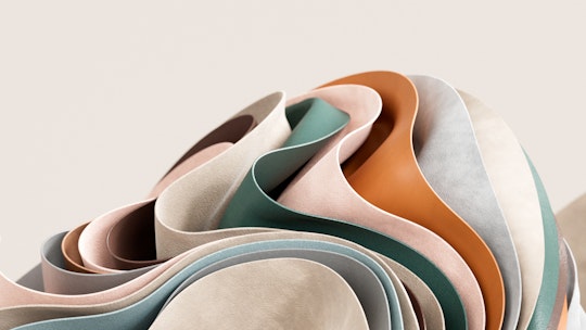
Golay: The cloth material inspired a pile of cushion Tetris shapes that highlighted the nice wrinkles created by the movement of the shapes. It's always very satisfying to see Tetris shapes fitting perfectly together, and the cloth simulation was also a great opportunity to create an interesting movement in leather sheets. The motion highlights the way different grades and grains of the leather surface catch the light.
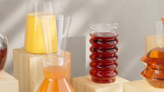
Golay: Working with liquids and transparent textures like glass is always challenging. We designed various unique carafes to simulate an elegant drink display. And stones tend to work well in a product visualization type of shot, and we recalled a gravity-defying sculpture of stacked stones that inspired us to create our own sculptural display using geometric shapes that resemble stone samples.
What were some aspects of Capsules that you found helpful for the project?
Armand: It was interesting to engage in a bit of reverse engineering to understand how the materials were constructed in Redshift. We appreciated the attention to detail in the node structures. For example, it's great that the materials are constructed in a way that makes it very easy to customize the colors.
The Triplanar projection mapping was already set up, which was a time saver as there was no need to edit and refine the UV map. Plus, there was a pre-set ramp node to control the level of roughness, which was pretty useful.
Another intriguing aspect of Capsules is that some materials, such as Old Plastic, already come with surface imperfections, so 3D objects look more realistic. That worked well for our plastic Capsule video where we experimented with various aging effects, giving each plastic shape a multitude of imperfections to help tell a story about the object and make the image more convincing.
What other experimental projects have been influential in your work?
Golay: In April 2022, we applied for the Almost Perfect Art Residency in Tokyo with an experimental project to celebrate the Nakagin Capsule Tower, which was due for imminent dismantlement and destruction.
That fantastic building had constantly stimulated and fed our imaginations. Once celebrated by design lovers, the building was perceived by some as a failure in Japan. We felt the significance of the emotional connection between former residents and their capsule apartments and our “Nakagin Capsule Memories” project that sought to tell their stories through our art, evolving the Tower into a new digital state.
Have these experimental challenges inspired any commercial projects?
Armand: Google approached us to create artistic reinterpretations of their Nabla Font. The collaboration aimed to develop five-letter sculptures that spell out the font's name. The project was a significant milestone in our careers as it was the first time a client had asked us to apply our unique style to the development of a 3D font.

Our visual research revolved around Nabla's characteristics, which are isometric and variable with depth and highlight axis. Google’s team had a high level of trust in our vision and our collaboration with them was incredibly smooth.
Helena Swahn is a writer in London, UK.
