Creating Titles for an Audience of your Peers Boxfort explains how they used 2D, 3D, cel animation and artist-centric humor for the HalfRez 8 titles.
The popular Chicago-based motion event Half Rez may be canceled for 2020. But it will be back, and members of the Detroit-based artist collective, Boxfort, have been joining industry professionals for the one-night extravaganza for years. So in 2019, when organizers reached out to 3D artist/designer Billy Chitkin (aka Gernge) to see if he wanted to create the titles for Half Rez 8, he immediately gathered the rest of the Boxfort collective for a chat.
“We all wanted to do it, and because they offered full creative freedom, it was very liberating for us to get to make whatever we wanted,” Chitkin recalls. Opting to tell a cohesive story, Boxfort decided on a plotline in which three attendees from separate worlds meet up on their way to Half Rez and encounter something evil that artists know all too well. Using Cinema 4D, cel animation, Photoshop, Redshift, After Effects and more, they created a title sequence packed with Easter eggs and inside jokes to get the audience of their peers laughing.
To make the project more manageable, Boxfort broke the story up into three parts, the first directed by Nick Parente, the second co-directed by Julie Craft and Dave Holm and the third directed by Chitkin. I asked Parente, and Boxfort co-founders Chitkin and Craft, to talk about the collective’s work on the titles. Here is what they said:
How did the Boxfort collective come together?
Chitkin: Five of us went to school together. We’ve been friends ever since and we started our careers together. We met Julie because she started our local MoGraph Mondays meetings, and we all became super good friends. I had freelanced at Gunner, which is in the same building as we are because, in 2018, a few of us got the idea to get our own office here too. There are eight of us at Boxfort now and we’re all individual freelancers, but we work together on other projects more and more. Having all of us in the same room makes for a lot of camaraderie, and we’re all able to practice and learn new skills from each other.
We’ve had so many people want to talk with us about starting a collective. I have to say, there’s something cool about being in a room with your friends working on things together. People question whether we can make it in Detroit, like if you’re not in LA or New York there aren’t enough artists to come together and create a community. But we’ve built a good community here in Detroit through Julie’s efforts organizing our local MoGraph Mondays.
How did you guys decide on the story you wanted the titles to tell?
Craft: From the start, we thought about having kind of a video game theme. We liked the idea of three characters coming from separate places, and we thought they might battle something, or they would all come together to battle a big enemy and their weapons would be based on different Adobe and Maxon tools. We talked about the characters getting powerups and having some VR. Once we got into the timeline, though, we realized we had too much going on, and not just because of time constraints. It was just too much for an audience at a conference. We wanted to get people excited, so that’s what drove our pacing.
Chitkin: We also wanted to be able to use everybody’s skill set, so we thought about how to incorporate cel animation with 2D and 3D. There’s a lot more blending of those tools in our industry now. Between us we have such a wide range of skills, and we trust each other so much, we don’t worry about who is doing what. We think about how to make things look as we envisioned them. And we all want to get different roles under our belts and learn how to let someone else take the lead on projects.
Describe your work on each of the three sections.
Chitkin: Nick’s character in the first section is on the subway heading to Half Rez. That section uses cel animation and, at one point, the character jumps up and starts turning into a bunch of shapes and different things. Illustrations were done in Procreate and other Boxfort members, Scott Hoch and Justin Lemmon helped with color development, illustration and cel animation. (Check out Nick Parente’s process here.)
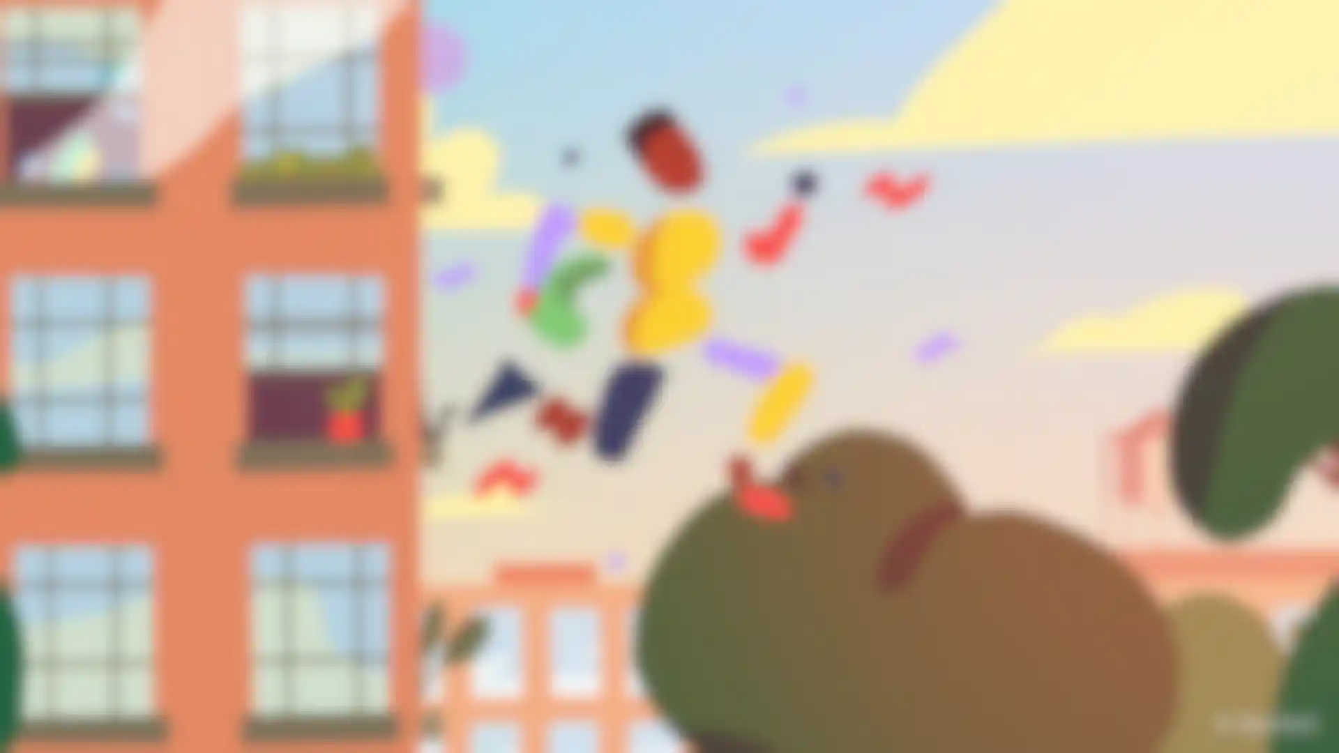
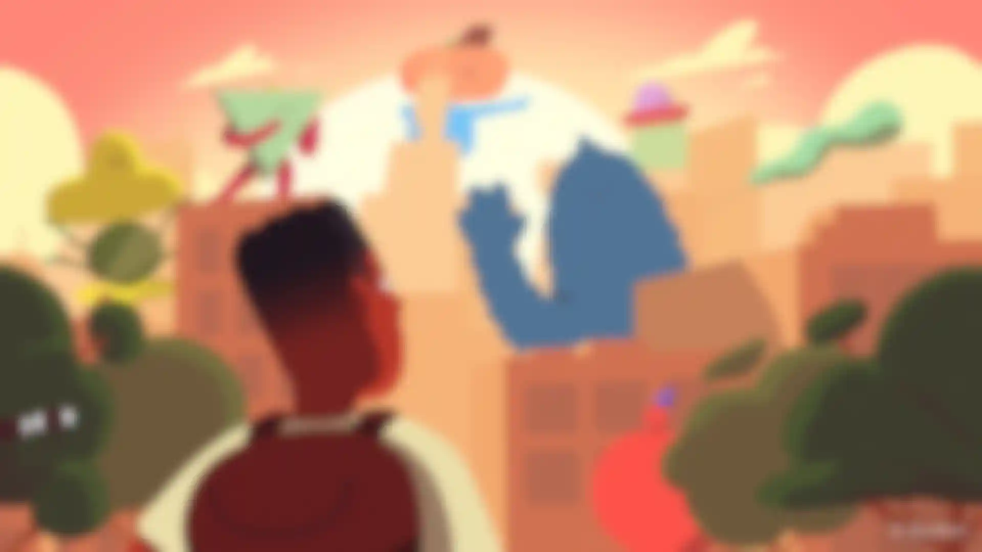
Parente: We used Rough Animator for the cel animation and all of that, and the illustration, was done on an iPad. Scott took care of the majority of the cel work. For one particular shot (above), I animated the character jumping in After Effects, and then Scott drew over those frames to turn him into wacky-shaped boi. Because the motion matched so nicely, a simple cut between worked perfectly.
Craft: We wanted each world to have a different feel. I did the second section, which is a mix of 2D and 3D, with Dave Holm. We decided on a semi-realistic forest and we were going for kind of Lost Woods from The Legend of Zelda sort of feel with light coming through the trees and fog. I used Cinema 4D and Redshift for the volumetric light rays. Being able to art direct all of the lighting in Redshift was great because I could tell each light how much to contribute to the volume and get some beams to be brighter, or more or less transparent.
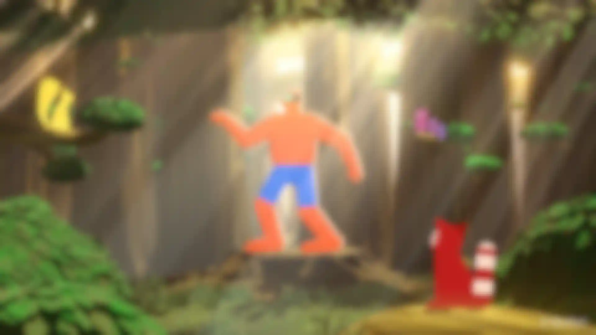
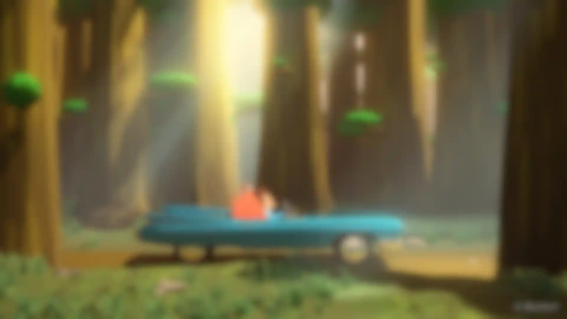
We thought it would be fun and weird to have a character playing a nerdy video game in the forest before he jumps in a car and to get to Half Rez. I was doing a VR project at the time, so I was experiencing how, when you take the headset off, you feel weird at first, like you expect your hands to go through things and stuff. We wanted to recreate that a little bit, so the forest is quiet until you’re in the game and then there are tons of effects and it’s loud and intense, meanwhile nobody else is experiencing what the character is experiencing.
To give the forest the feel we wanted, along with the shafts of light, I thought it needed to have a lot of ambient movement and detail without feeling too realistic. I used C4D cloners and matrix objects to cover the bushes, branches and ground with lots of individual leaves and blades of grass. I didn’t want to try and simulate all of those objects using wind and dynamics, so I used random effectors in noise mode for constant movement. And I used shader falloff with a noise shader to simulate wind movement, and I animated the movement property of the noise.
Chitkin: The last section is all 3D and I worked on it mostly myself, but I did have some help with the giant, evil sheep creature from a local friend, Anthony Maiuri. That’s the thing that the three characters meet up to face at the end, and any motion graphics artist will know what it is because when After Effects crashes it makes that sheep noise. We know and fear that sound, and we thought it was a good way to inject some humor into the titles.
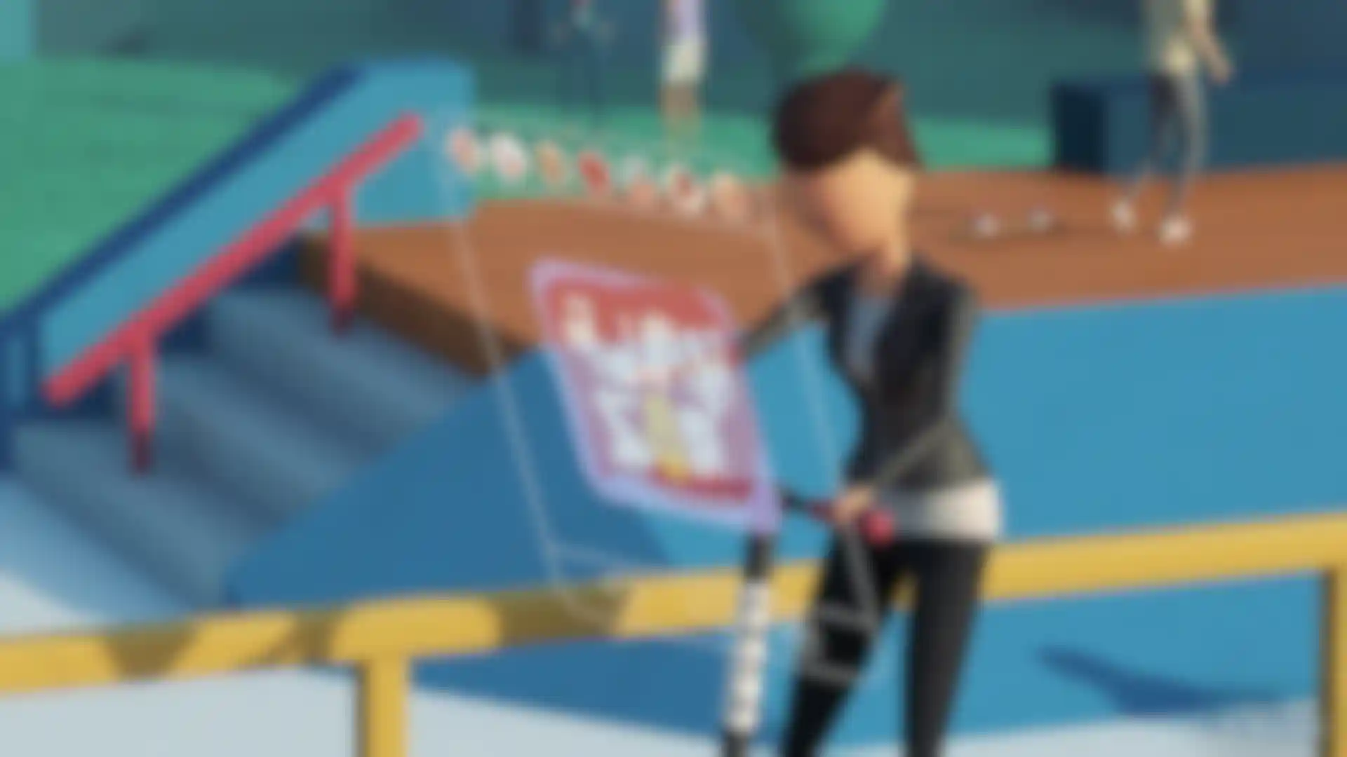
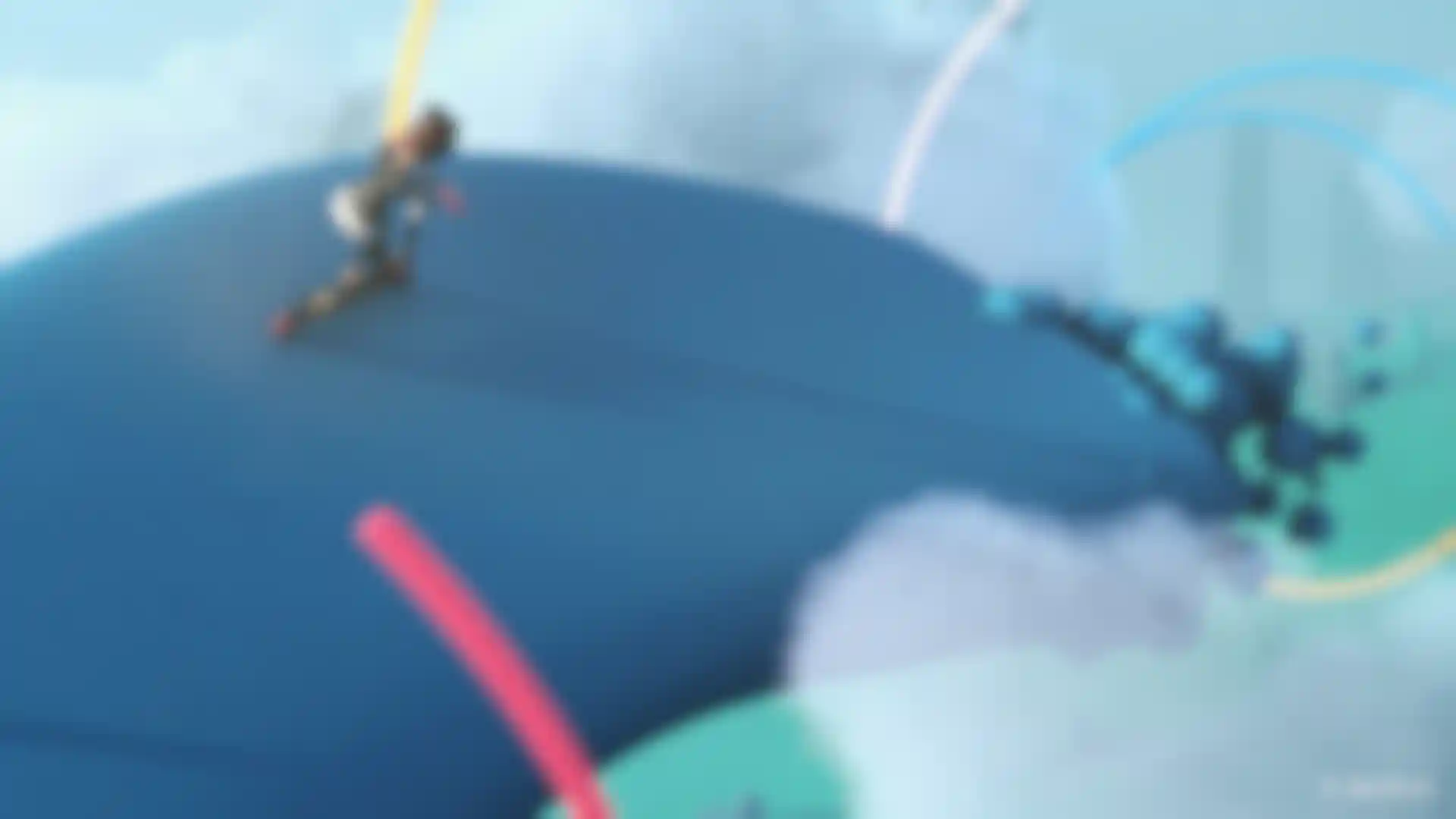
I used character models from Aleksey of Ace5Studios. They’re premade and offer enough flexibility, I decided to use them for all of the characters. The main character is a woman riding a scooter, and I animated her by hand. I used Mixamo to animate the other characters you see in the background. I had never used that before, so it was fun to learn. I storyboarded my section on flash cards, rearranging them until I was happy with the overall sequence.
Then, my process was just blocking out the different elements for all of the 3D scenes, starting with very rough versions of the city, skatepark, skyscrapers and more. I spent about two weeks blocking out my whole sequence, and then the following weeks refining everything, making it as polished as I could as well as getting the timing as tight as possible.
My whole section is weird. I just tried to have fun and make dumb jokes. There are people falling down, and the woman is riding her scooter around in the sky where aliens are dancing, which is another dumb joke we have in our office. The scooter says Turd on it instead of Bird. I noticed that actually happens in LA because people are always vandalizing those scooters. Really, I think we all just wanted to make people in the room laugh so we were trying to be goofy and zany. And then to finally end things off with a bang, our sound designer, Wes, helped us bring everything together with awesome work throughout and then topped it off with the final sudden ending that kicked off the event.
Credits:
Nick Parente - Creative Direction, Illustration, 2D Animation
Julie Craft - Creative Direction, 3D Design, Animation
Dave Holm - Creative Direction, Illustration, 2D Animation
Billy Chitkin - Creative Direction, 3D Design, 3D Animation
Scott Hoch - Cel Animation, Character Design, Concepting
Justin Lemmon - Illustration, Concepting, 2D Animation
Jake Williams - Illustration, 2D Animation
Anthony Maiuri - 3D Character Design
Michael Condon - Additional 3D Asset Creation
Wes Slover - Music & Sound Design