Using Maxon One to Create Posters for Netflix and Disney Mondlicht Studios explains how they mixed magic and realism to create two captivating poster series.
Coming from a strong automotive marketing background, Germany-based Mondlicht Studios also creates content for a variety of other creative areas, including poster art for TV series. As part of a long-standing collaboration with Rhubarb, the studio recently produced posters for Netflix’s “Shadow and Bone” and ABC’s special “Beauty and the Beast” 30th anniversary celebration.
Founded in 2019, Mondlicht has already received Promax, Motion Design and Clio awards and their talented team of digital artists have developed a sophisticated pipeline that includes Cinema 4D, Redshift, ZBrush, Unreal, Blender, Adobe applications and much more.

We talked with the Mondlicht team about their work on both poster series, and here’s what they had to say.
Tell us about your studio.
Mondlicht: We are a creative CG studio specializing in automotive, advertising, entertainment and other visual media projects. Over time, we’ve diversified our repertoire, introducing product animations, key visuals and campaigns for projects spanning the medical, beauty, food and a wider scope of entertainment sectors.

Did you intentionally focus on automotive projects in the beginning?
Mondlicht: Yes, with the strong automotive background our team had we made it a focus early on. One of our CEOs, David Schaefer, worked for Mercedes-Benz for more than a decade before founding the studio. Since 2020, though, we've had the privilege of collaborating closely with Lucid Motors, assisting them in diverse areas, such as full-CG animations, image production, post-production, modeling, R&D and more.
In November, Lucid Motors presented Lucid Gravity at the LA Auto Show, and we were very happy to see how the content created by our team enhanced the Global Reveals. We’ve also worked with BMW, Mercedes, Nissan, Setra and other brands.
We remain enthusiastic about automotive projects because we love cars. And if you can handle complex automotive projects, you will be able to transfer that experience and skillset to almost any other product or challenge that you come across.

Tell us about how you got these two poster projects for Netflix and Disney.
Mondlicht: Our collaboration with Rhubarb has spanned many years and we cherish the partnership deeply. Working with Rhubarb's creative team, especially Andrew Irving and Ryan Jones, is always a delight. Their expertise in developing visual concepts is unbelievable and we eagerly embrace every opportunity to embark on a project alongside them.
How are poster projects different than other things you do?
Mondlicht: One intriguing aspect of a poster project is that sometimes you don’t get an in-depth view of the product when you start. If a movie or series hasn't been released or is still in development, we rely mainly on a briefing, mood boards and some context.

Deciphering the rest becomes our task, and it's a challenge to manifest everything into beautiful art that makes the process so captivating. Sometimes we have a lot of freedom and, other times, we are working with ideas that have already been defined.
Beyond that, your work undergoes scrutiny by individuals deeply familiar with the content, often its very creators. They possess a profound understanding of the intended mood and tone. Thus, developing an acute sense of client understanding is vital. It enables us to determine the precise emotions to be depicted and the optimal approach and leverage our digital artistry for every project.
Good art direction is the key to projects’ success and thanks to the vast, multi-faceted experience of our CEOs, Dmitriy Glazyrin and David Schaefer, the team always has a clear direction.
Talk about creating the “Shadow and Bone” main poster.

Mondlicht: For this poster, Rhubarb provided initial direction regarding the specific symbols and their shapes, but we had to invest a lot in the R&D stage and brainstorm the concepts together with Rhubarb’s creatives to come up with the visuals that the client approved. With this kind of project, the look development process is paramount and fine-tuning materials and lighting is essential to convey the appropriate ambiance.
We used ZBrush, Cinema 4D and Blender for modeling and Cinema 4D and Redshift for the 3D production, as well as Photoshop to get the final look we wanted. Being able to get to where you want as efficiently as possible is critical for promotional materials. Posters like these must evoke a powerful connection to the series at first look, so there is a lot of exploration and the usual tight deadlines.
Walk us through the process for making that poster series.
Mondlicht: The initial request was straightforward: craft symbols resembling of the weapons used by the heroes or their inherent powers. Rhubarb provided clear directions and detailed mood boards for most of the characters. Some symbols necessitated a from-the-ground-up approach, including conceptualizing a visual representation from scratch. Together with Rhubarb, we created 15 character posters and the key art for the series.
For example, we leveraged the diverse talents of our team to create the symbol for the character Zoya Nazyalensky, a Squaller with the power to manipulate wind. On our team, Anton Verein and Ilya Nodia followed a traditional pipeline, formulating ideas on paper and in digital realms together with Dmitriy, who was art directing.
Meanwhile, our Creative Producer, Zhanna Travkina, employed AI tools to get different variations of the symbols for future possible development. While AI is not suitable for creating solid work based on a specific task, it’s great for first drafts, allowing us to blend various options and choose the best direction to produce high-quality results for our clients.


Once all of the concepts were approved and we’d solidified the primary direction for each symbol, we delved deeply into production. Sven Giera from our modeling department prepared a solid base for the symbols. Then, we refined some of them in ZBrush, incorporating intricate details and subtle imperfections to achieve a photorealistic finish.
Once the modeling phase was finalized, we transitioned to look development. While the material setup may appear straightforward at first glance, it necessitated numerous experiments with material development and lighting. Making something shiny also look great can be a challenge, so Dmitriy used some neat tricks in Redshift to give the materials a captivating look and rough up the surface with microdetails to get something convincing.
Let’s move on to talking about the “Beauty and the Beast” character posters.
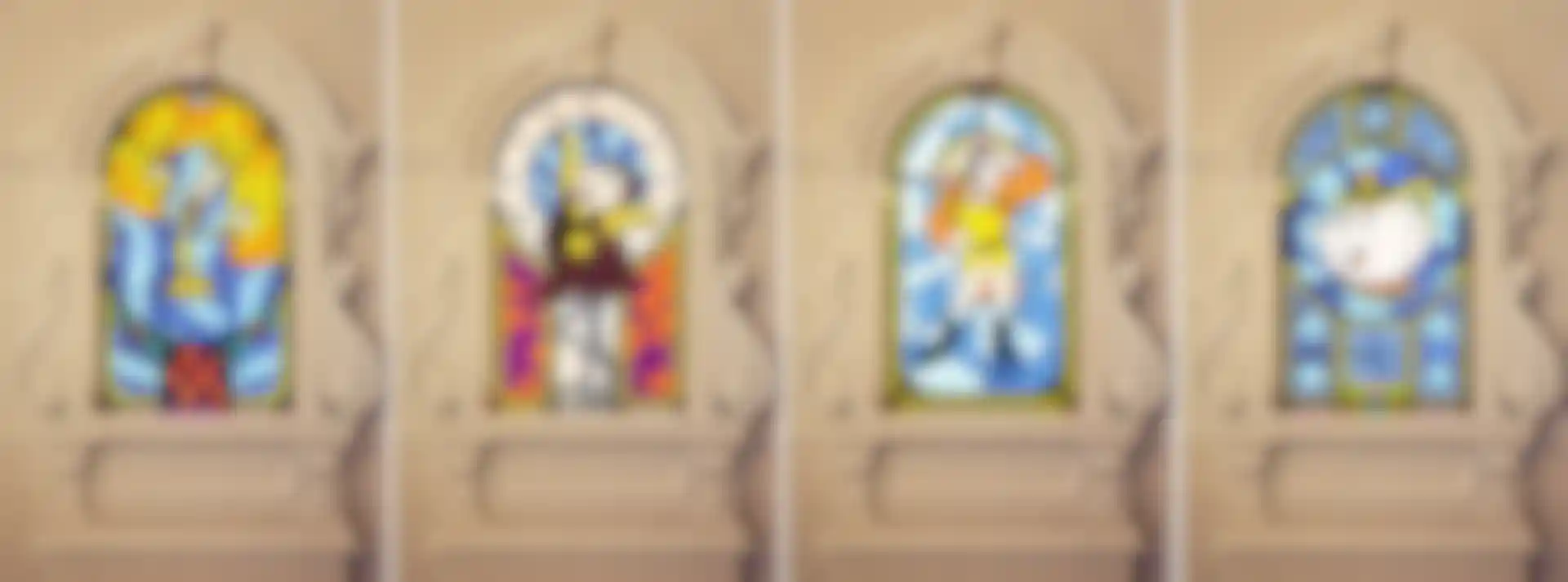
Mondlicht: We made 12 posters for this series, which blends the splendor of the original film with a modern interpretation. The brief for the character posters was very clear. We had to craft stained-glass windows, drawing inspiration from the original cartoon's designs juxtaposed with the photography of the actors.
Melding the actors with the heroes from the cartoon helped show which actor plays which character and added a magical, enchanting, fairy-tale feel to the posters, which was perfect for Disney and this production, in particular.

We began by concepting the ideas for the windows in Illustrator, creating a solid design direction for the modeling phase. That allowed us to streamline our workflow, enabling us to complete all 3D modeling for the character posters in just a week. The biggest challenge by far was retaining the original Disney charm.
With the window models finished, we moved on to look development. We drew inspiration from the cartoon's color palette to further associate the windows with the ambiance of the classic animation while also fitting the colors to the characters. Finally, the linchpin for these posters was the lighting. It not only evokes a fairy-tale mood, it also emphasizes the characters and directs viewers’ attention.
What was your process for creating the ballroom and books environments?
Mondlicht: The posters featuring the books and the ballroom presented unique challenges. Crafting the 3D set made entirely of books was relatively straightforward but recreating the ballroom was an interesting task because it was important to mirror the space from the original movie while achieving a photorealistic finish.

Transferring the original cartoon into a rather realistic and highly detailed ballroom that captivates the original flair was particularly challenging. Sven gid a great job interpreting the old movie frames and creating a highly detailed ballroom.

During our modeling process, it was essential to ensure the accuracy of the ballroom’s windows, especially since they would be incorporated into the character posters as well. If you look closely, you'll notice that the windows aren't just abstract designs, they are integral elements of the ballroom. That space is central to the cartoon and it stands out as one of its most iconic settings.
What kind of feedback have you gotten on these projects?
Mondlicht: Both of the clients, as well as Rhubarb, were very happy with the outcome. The posters gained significant attention, making appearances in Entertainment Weekly and Collider. We're truly gratified by such widespread coverage and we’re hoping the success of these posters will lead to more work like this.
Mike Hoium is a 3D Artist and Maxon One User.